Concept Research: Colour & Layout

After researching into the structure and functionality for my website, the next part of the process was to look into the aesthetics and design. I had looked at the websites I had already used for inspiration and found that they had a recurring theme throughout, all of which they are similar. One key thing I noticed was that they all used the colour green; quite clearly to represent food, environment and healthy living. Although this is a theme I want to implement into my design, I also need to include the aspect of social media, therefore the colours and overall layout need to be altered in order to fulfil both purposes. Below is a list of screenshots of the websites I had mentioned in my proposal evidencing the layout and colour schemes they use:

Food waste websites

Screen Shot 2016-02-18 at 10.48.07

Screen Shot 2016-02-18 at 10.47.05

Screen Shot 2016-02-18 at 10.47.27


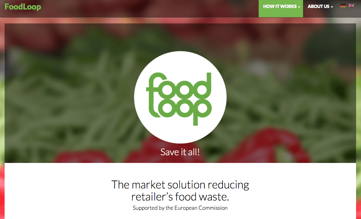
These websites all utilise a similar layout- they all have a banner with ‘tabs’ or buttons at the top of the page so that the user is clearly informed on how to navigate the site. They all include a main image which draws the user’s attention and helps to establish the sites purpose and aims. They also use basic shapes such as circles and rectangles- this helps to create some sort of form and structure in which the user can scan the page and easily spot the assets on which they need to click on. I will be using a similar layout in my own project to ensure that the site is legible and easy to use for the target audience.

Social media website logos

twitterlogo  fblogo skypelogo

Social media sites tend to use the colour blue in both their logos and their themes. This is possibly because blue represents technology but also calm, peace and generally symbolises ‘trust’ which is something that users need to feel when socialising online. However, as my project is not just focused on social media it is not wise to use the same colour scheme which could potentially be misleading for the users.


Concept Research: Elements of Design

As stated in my previous post, I had looked at the book ‘Digital Design Essentials: 100 Ways to Design Better Desktop, Web, and Mobile Interfaces’ by Raj Lal in order to find out what would be the most appropriate and relevant design to my own project. Although these apply to mobile applications only,  I will be using this when it comes to making a mobile design version of my website.

Adaptive User Interface

‘An interface that adapts itself to a particular context or for a user with special needs’

  • Website changes its layout to suit the device
  • Allow content navigation
  • Accessible navigation sidebar
  • Option to skip to menu
  • Make menu accessible from keyboard
  • Proper nesting of headings
  • Image size changes with the layout

Branded App

  • Branded splash screen
  • Ability to share makes it social
  • Support page
  • Keep the theme and style consistent with the product/service

Consumer Service App

  • Keep the app straightforward for the specific service and functionality
  • Keep the app quick and to the point
  • Focus on the relevant service for mobile users

I could also take this information and apply it to my website design, although I would have to think carefully about what would be relevant in relation to each device. For example, as users can only access one screen at a time on mobile I will have to design each page carefully so that it does not mimic the multi-page element of a computer website.

Concept Research: Website Functionality

As established in my proposal, I have done some research into the what kind of functions my website will need. I have also looked at the kind of layout/design that it will need in order to be suitable for the target audience and its purpose. Using the list of texts that I had proposed to use, I had found some valuable resources into the different types of websites that exist and the ways that they are structured. There was more than one example which would suit the purpose and intended design for my own project, so I took multiple elements from each and have decided to apply these to my draft designs.

According to the book ‘Don’t make me think’ by Steve Kruger, the main elements that a website will need to implement are:

  • A clear visual hierarchy
  • Make it obvious what’s clickable
  • Break up pages into clearly defined areas
  • Keep the ‘noise’ down
  • Omit needless words
  • Have a good tagline where appropriate
  • I.D. site logo is important for the user to know they have not navigated to another webpage
  • Use clearly labelled sections (menus must have a ‘parent’ and ‘child’ section)
  • A search tool
  • Use tabs where they are suitable
  • Get the message across clearly

I have also listed some key elements that my own project will need to include:

  • Menu display
  • Booking function
  • Social media asset (to invite people to have meal- where and when)
  • Generic design- colours and typography must appeal to virtually everyone (although adults will use the site, not children)
  • Two ‘outputs’- one for cafes/restaurants and one for users
  • Cafes should be able to see who has booked, when and where
  • A place to edit and show their menu
  • Users should be able to invite people, see available menus and book a place

Finally, for the App version this will need to have:

  • Touch screen only functions
  • Easily to read
  • ‘One screen at a time’ method
  • Larger font and images
  • Touch screen function only- no mouse hover for example
  • Have an essence of ‘quickness’ as apps should be faster to use, i.e. on-the-go

Composition Practice: ‘Epic Journey’

epic_journey_natasha

This is an image I created using pre-created vector images and brushes in Photoshop. It signifies the idea of an epic journey as I included the theme of a knight on horseback, travelling through a forest to rescue the princess in a far-away castle. I had to carefully think about the composition using the thirds grid, so I used two diagonal points in which to place the main focal points. These two points (knight and castle) had to portray the narrative accurately, so in order to achieve this I altered the size accordingly. The trees were not only used to build up the forest design, they were also used in order to draw the viewer’s eye towards the main focal point. By creating a ‘dip’ in the valleys/mountains, this also helped to make the castle more prominent in the whole image.

Some things I could improve on with this image is the outline of the knight and horse– when zoomed in the edges are somewhat pixellated which need to be fixed in order to give a crisp, clean vector. I could also perhaps change the colour scheme to either green or purple (having elements of nature and fantasy respectively). Perhaps utilising the other main focal points as part of the thirds grid would have helped, however this would have needed experimentation as there is a risk of overcrowding the image.

Project Conceptual Design: Idea Inspiration

My main inspiration for this idea came from these four concepts:

logo   logo_chair_brown  foodloop  FoodCycle-Logo


Love Food Hate Waste is a scheme created by the organisation WRAP (Waste & Resources Action Programme) to help prevent people from wasting food in their own homes, as well as to encourage saving money by providing advice on how to buy only what’s necessary for a meal. They have a free app which provides a section for recipes (both suggested and personalised), portion sizes, meal planner, kitchen content information and shopping list. Although it can be assumed that this is a simple and effective way of saving food and money, it is not always easy to use and can be time consuming if a user has to list every ingredient (including weight) in their kitchen. The user interface and design however is clear, legible and not difficult to use, so I will likely be using a similar principle in my own idea.

Bisto’s Spare Chair Sunday does not necessarily aim to prevent food from being wasted, but it does strive to help combat loneliness within communities, especially among the elderly. It encourages those with extra space and food in their homes to invite an elderly person over for Sunday dinner, therefore helping to improve the lives of those who may not socialise regularly. Although there is nothing media related (apart from information on their website) it has provided some form of inspiration which I can use in my own project.

FoodLoop is an app created by a German citizen with the aim to stop good food from being thrown away by major supermarket chains. It gives users information on the expiry date of food products, which they can scan with their smartphone to check the price whilst in the store. As this food is close to its expiry date it is discounted, therefore saving people money who are able to use the ingredients within a day or so. Its alerts work on a real-time basis, which is a key concept that I could also use.

FoodCycle is a charity based in major cities around the UK which serves surplus food from restaurants to those who are not able to afford decent meals. It aims to use the leftover food for these meals so that it feeds the hungry instead of being dumped on landfill. It heavily relies on a volunteering system which is run through their website, but there is no evidence of any other key digital media aspects being intertwined. I was wary at first of going forward with my idea as I felt that this was too similar a concept, however after doing some brief research I discovered that the charity only has locations based in major cities, not local areas. My idea would differ from this in the way that it would encourage those who are living in smaller areas (and can therefore be used across a wider range of places). It would also be accessible to users 24/7 at any time and place, rather than solely relying on telephone and broadband connections.

The next step is to begin doing some research into how the project will function and what elements need to be included in order for it to be successful.