
After some brief feedback on my original mobile app design, I had made some slight edits as shown below:
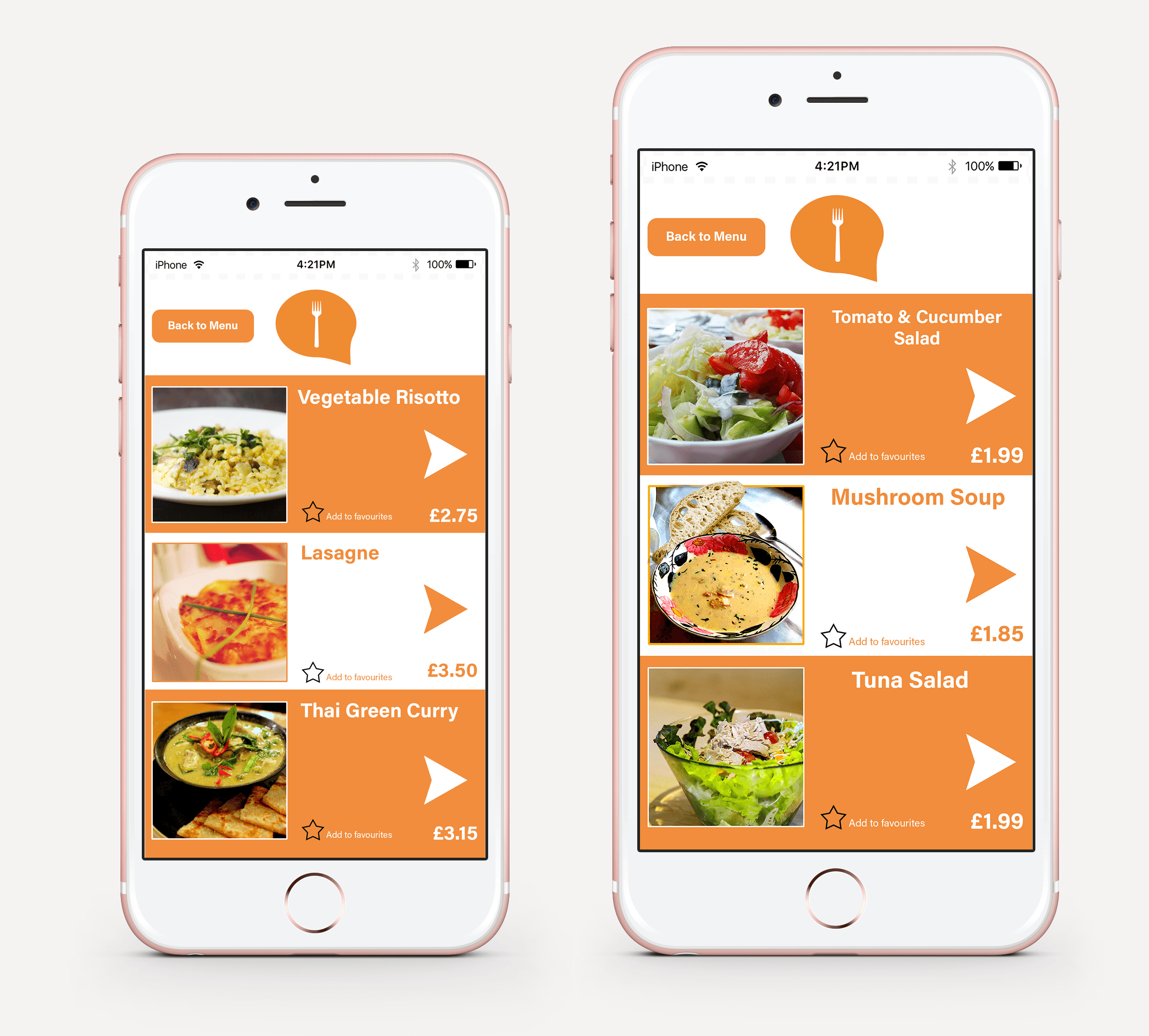
The original text had the description of the meal underneath its title, however I was told that this made it somewhat difficult to read and was unclear to the audience. I have altered this by adding a simple arrow to indicate that there is more information when it is pressed. In theory this would then lead on to another page which has the description of the meal with larger text that would fill up the whole screen. It would also be sensible to have a ‘back’ button so that the user could navigate back to the menu page.
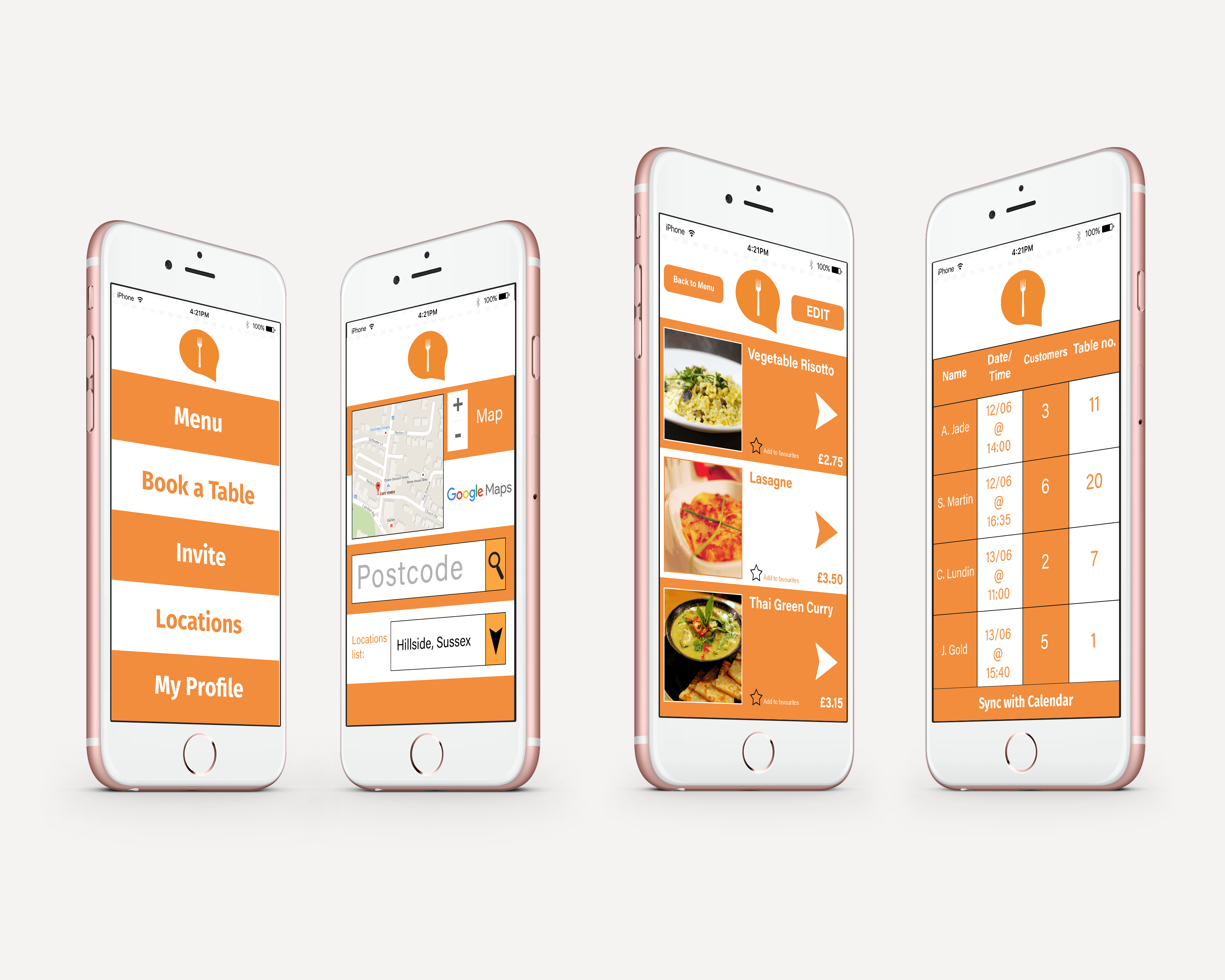
I have also chosen this iPhone template as this angle makes each screen clearer to the audience. On the ‘Locations’ page I have also cut out the description text as this was too small and detailed to display on such a small area. Knowing that my target audience would already have some familiarity with this concept before, the decision was made to put the word ‘Postcode’ in the search bar (which would disappear when text is entered)- this would be made obvious by the search icon (magnifying glass), allowing the user to then search for their nearest Eat & Greet restaurant.
The very right image is a display of the ‘View Bookings’ section of the Establishment version- the only addition to this is the black lines separating each booking section. I felt that this would make each booking easier to read for the user if it were displayed in this manner, rather than my previous version which had no lines to separate them.