Audience Feedback: Website Survey

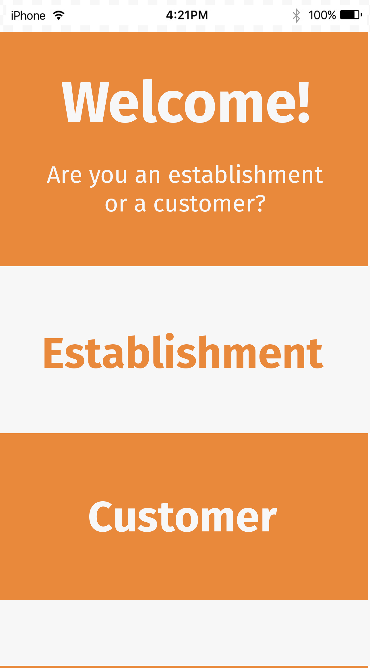
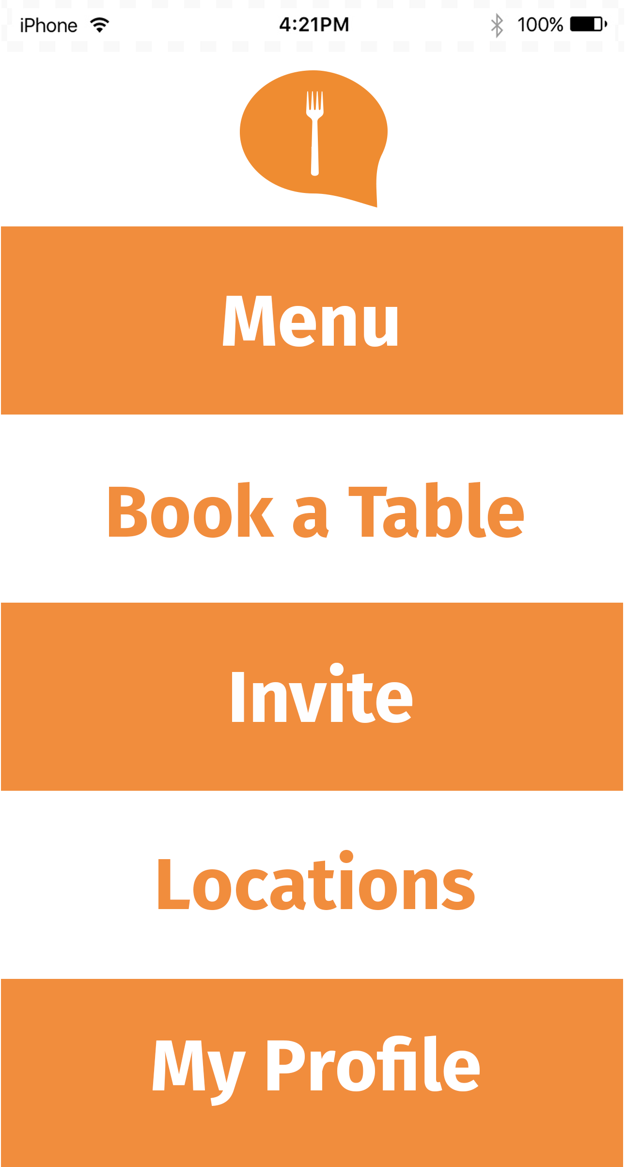
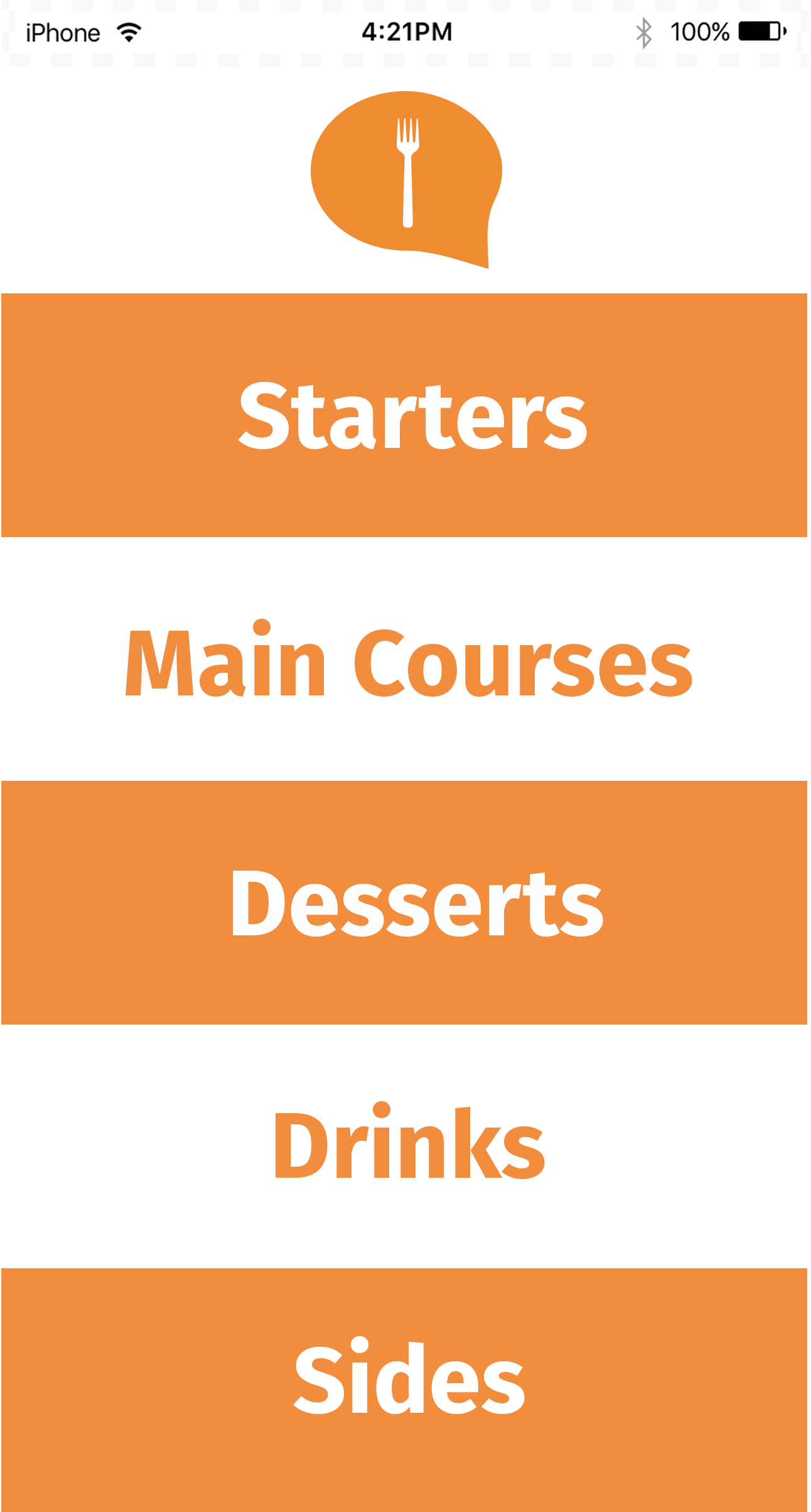
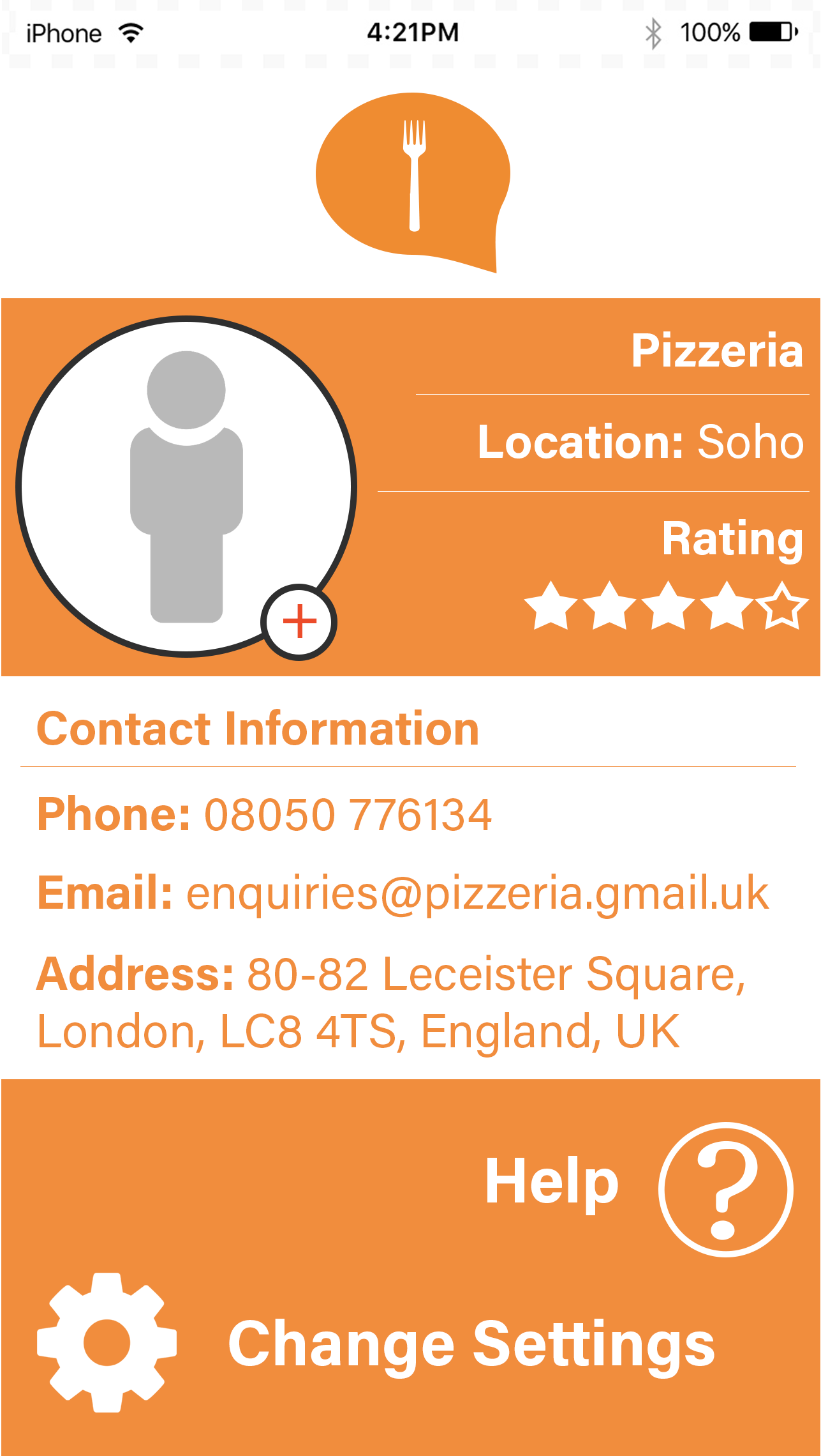
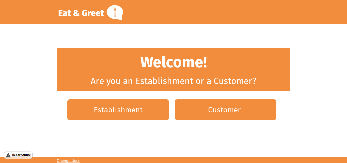
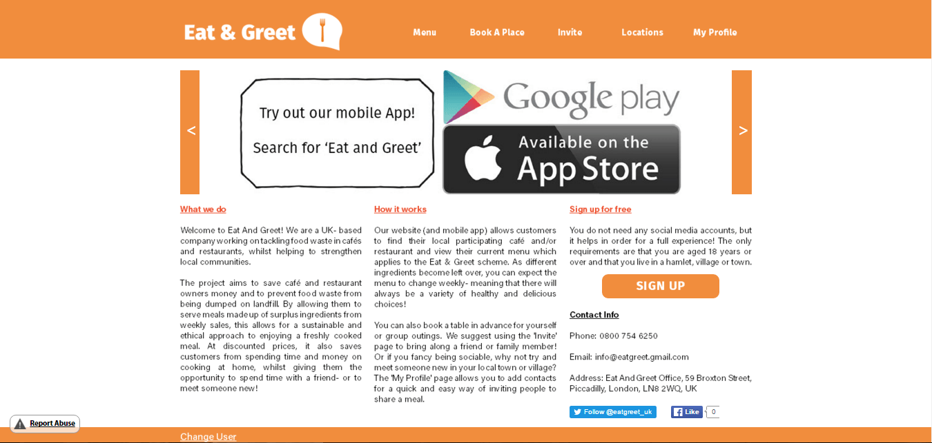
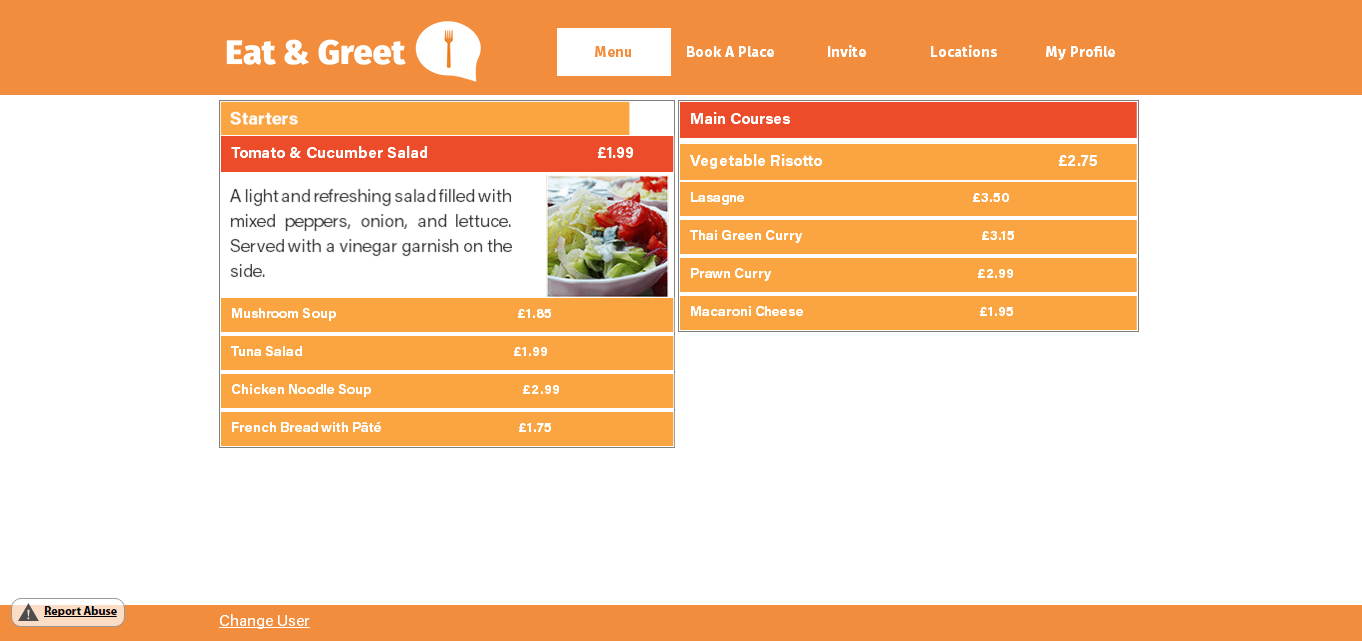
After having finished my final website design, I created a short survey using SurveyMonkey to get feedback from my target audience. I posted this on Facebook and Twitter in order to gain a quick response from as many respondents as possible. Unfortunately there were fewer responses than would have been needed, however this has still given me a rough indication of how effective my website is.

The survey results can be found here.

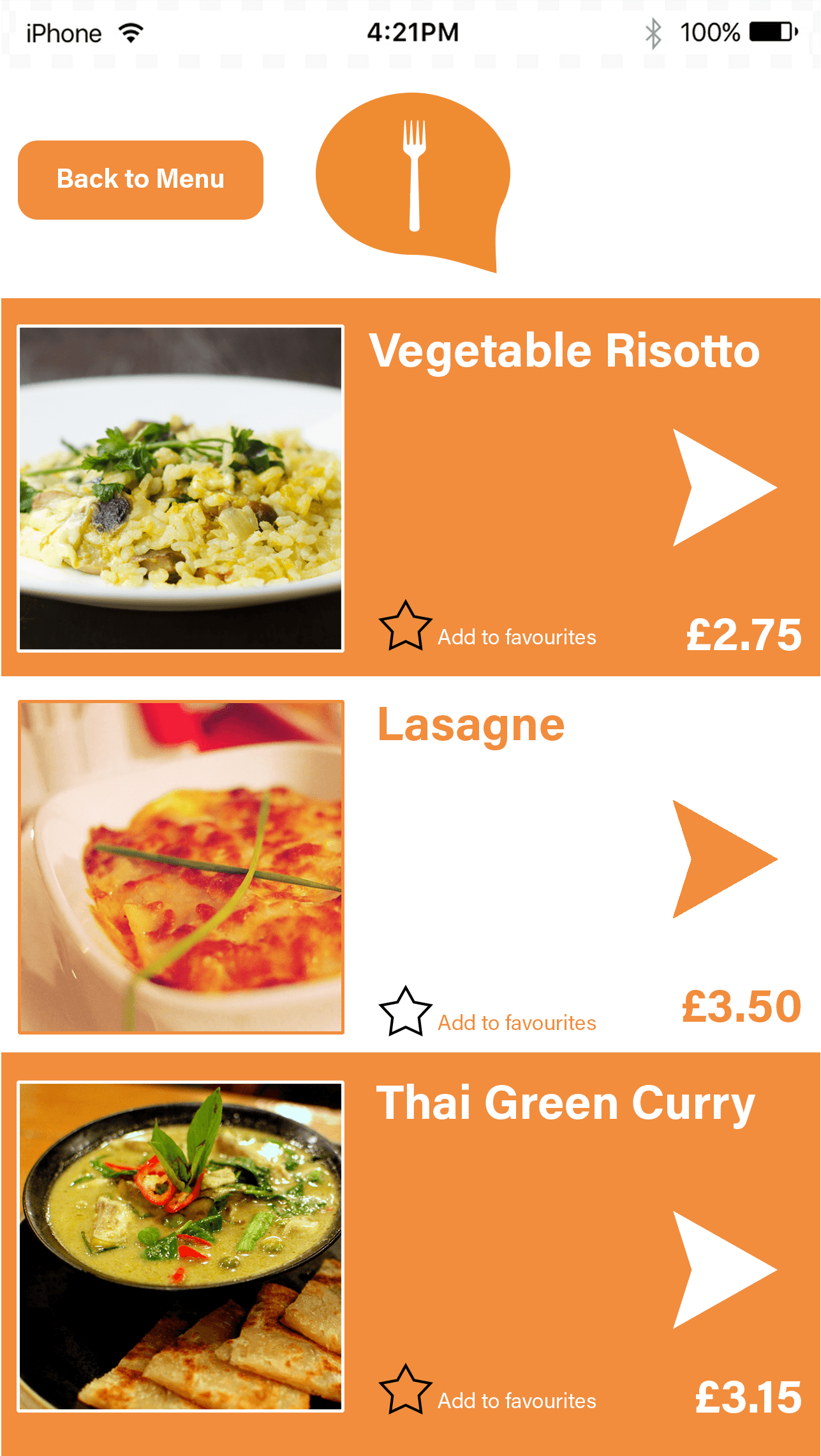
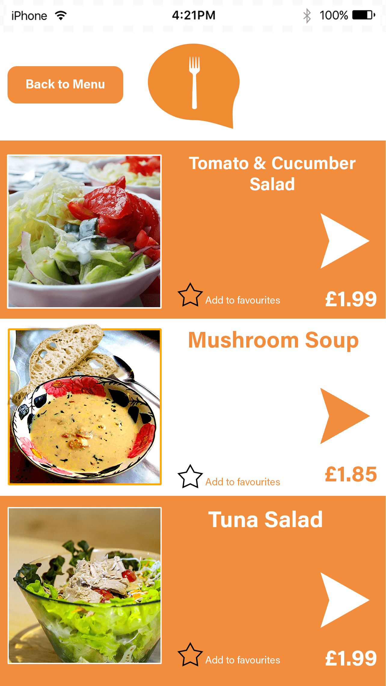
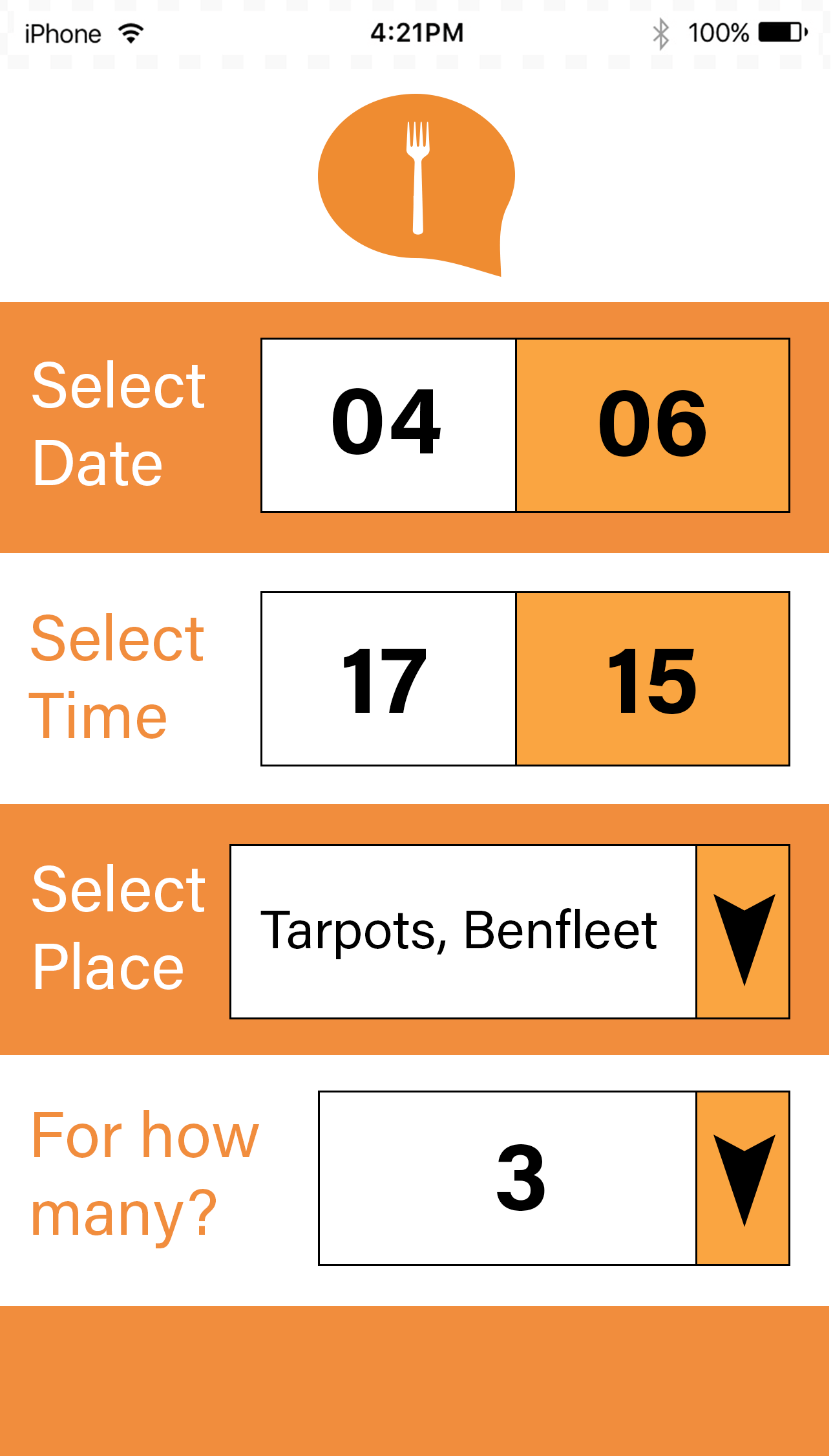
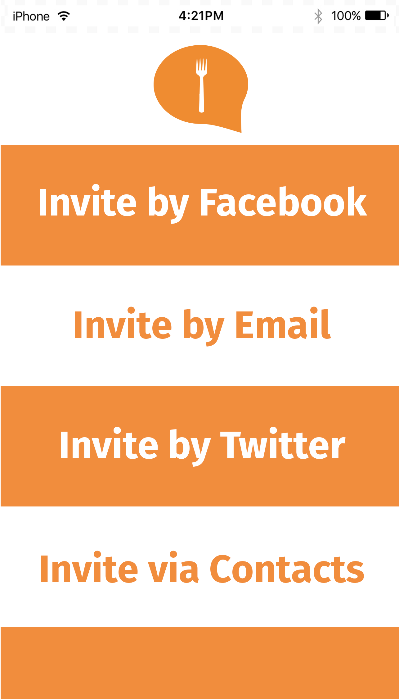
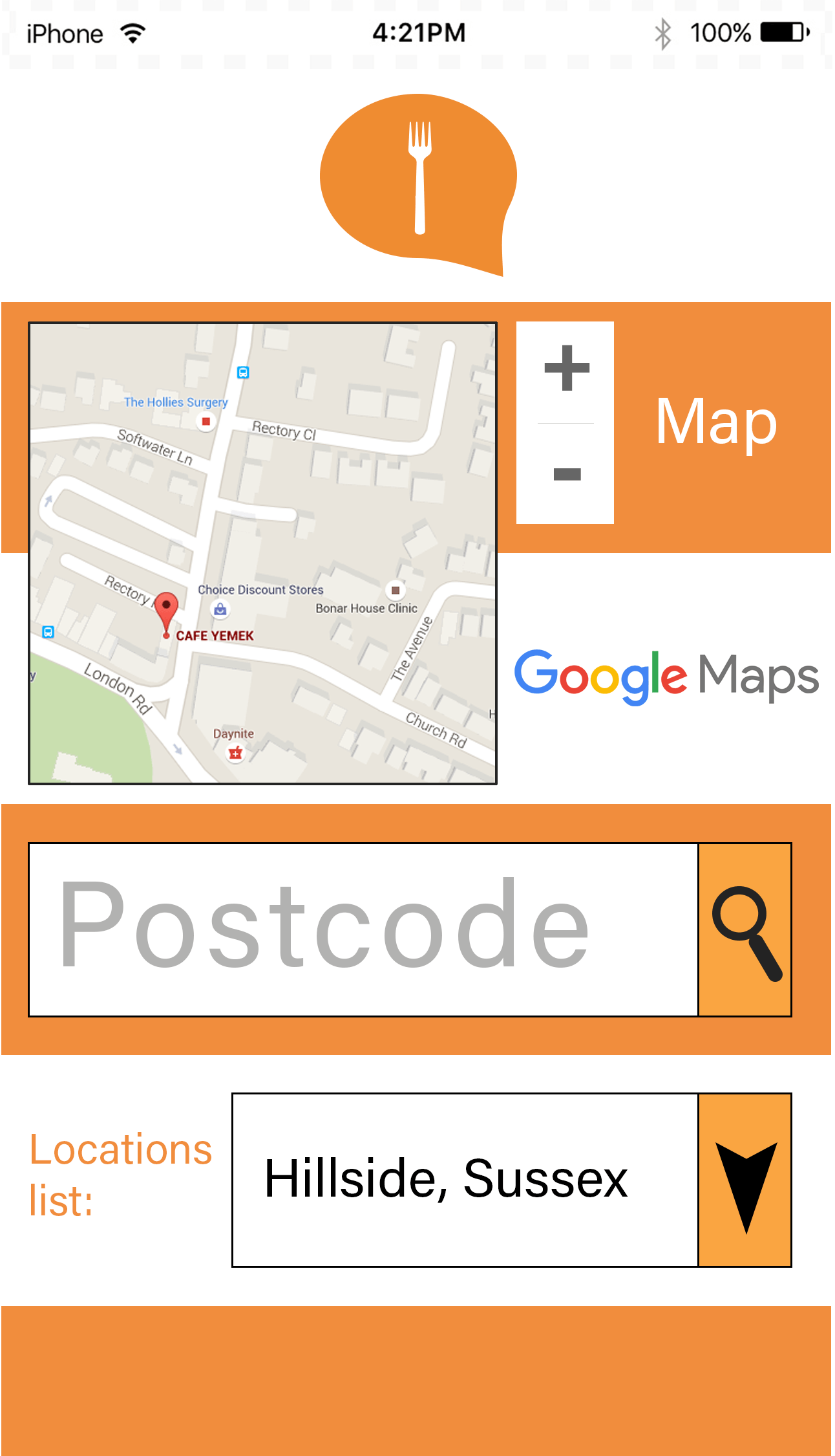
Looking at these results, it is evident that there are certain strengths and weaknesses of my website. All the respondents answered that the colours were either appealing or somewhat appealing, which shows that this was a good choice but could possibly still be improved. The website navigation is suitable and does not need to be changed as users responded that it was either extremely easy or very easy to use. In terms of the font, it was seen as easy to read and ‘somewhat’ easy to read, which suggests that perhaps using a different typeface would be more appropriate to ensure that the website is legible. There is a clear indication that the website is not as visually appealing as it should be, which suggests that there is room for improvement in this area. To refine this, I could probably change some of the colours on each page for a more interesting experience, as well as some of the spacing between certain elements so that there is less white space. It is clear to see that the information is easy to understand which means that this section could probably be left unaltered. There were mixed results for how suitable the website images are, which suggests that I could try multiple different images and gain more feedback until I get an all-positive response from the users. There were also mixed responses when asked if the website would meet the user’s needs. The majority of people responded ‘somewhat’ which means that perhaps there are features which need to be added in order for the user to have a full experience. If I were to re-design the website I would add more features before asking a question in the survey with regards to each specific area. This would then allow me to analyse which features are useful and which ones are not. Finally, the majority of respondents answered that the website is user-friendly, suggesting that this is one strength of the website which should stay the way it is.

Looking at the comments, two people answered “it is little bit boring website and very simple, you need to make more visual appealing and make more colorful to bring potential customers who will meet their needs” and “More colour variety and changes in layout”. These comments suggest that there are definitely areas to be worked on in terms of colour, font, layout etc. Perhaps using different colours for each page would make the website more visually appealing, however the composition would stay the same in order for the overall layout to be consistent in style.


Website Design

After having created my mobile application, I then moved on to creating a prototype for the website using Adobe Muse. Due to time constraints (and a large amount of duplicate design) only the customer version is displayed here, but the same principles would be applied to the establishment version. (Some pages are zoomed out due to their size).

welcome

This is the ‘Welcome’ page which users will first see when they visit the site’s URL. As for font and colour I have made sure that they are consistent along with the mobile design, so that there would be familiarity between the two. The two buttons below would link to each version so that it is easy for the user to navigate to the correct site. The only criticism I have of this page in particular is that it is too bland- originally I wanted this to be as clear as possible hence the minimal design, however I feel that some images or pattern behind the orange boxes would make the website more visually appealing and hold the user’s interest. Similarly to the mobile design, the logo is consistently displayed at the top (in this case, the top left due to the composition of a desktop layout) and links to the home page after the user profile is selected.

home

This is the customer home page. Although I have made the design responsive, there is still an issue with the width of each page not filling up the entirety of the screen. If I were to improve this in a future design I would make sure that the website fits the width of the screen no matter what device it is being accessed from. Although it cannot be seen in this still image, the top image automatically slides into a different image for a variety of design, which can also be changed manually by clicking on the left and right arrows. The image shown in this screenshot is an advertisement for the mobile app- I have taken this from seeing similar adverts on other webpages.

Although I have tried to stick to the design from the wireframe template, I made some changes to the layout which I felt were more suitable in terms of composition and ease of access (such as the menu pages being on the top right, for example). The contact information is on this page as not only did I not create a separate page for this, but I felt that it would be beneficial for the user to be able to access this information quickly. There is also an option for a Facebook like and Twitter follow so that audience members can keep up-to-date with the latest information without having to visit the website itself. The ‘Sign Up’ button would link to a form in which new members can fill out and create a free account in order to use the service. Although it is not shown here, it would be sensible to add an optional ‘Log In’ section rather than the user having to visit the Profile Settings under the ‘My Profile’ page. The bottom left corner says ‘Change User’. This was added as a hyperlink to the welcome page if the user accidentally clicked on the wrong button.

menu

The Menu page (although only displayed two core menus) is made using widgets in Adobe Muse. I used an Accordion panel as this was the most visually appropriate way to display the menu items without it taking up too much space. With this feature it could display the title and prices of all the menu items at once, however if the customer wished to see the item in more detail they could simply click on the box and see the information displayed. When one item is opened the other closes, meaning that the user would not have to worry about scrolling through pages of text just to navigate to the item they want.

book

This is the ‘Book A Place’ section. I used an external Adobe Muse widget and modified it for the purpose of my project to build this. This is the page which varies the most from its mobile counterpart, however it would still integrate a drop-down menu for the list of locations whereas the other features can be typed. If this were to be fully functional the system would be able to detect whether the customer entered an invalid value (for example, a time when that particular restaurant was not open or if the email address is invalid) and display an error message as appropriate. They can then submit this information to the establishment using the button below.

invite

The ‘Invite’ page follows the same formula as the mobile version, however here it is broken down into clearly defined buttons. Icons have also been added to allow for a more visual experience, as well as to make it more obvious what each title means. Each button would link to a separate page in the same way as the mobile app would do, allowing the user to send an invitation to their friends, family, etc.

locations


The ‘Locations’ page works in the same way as the mobile version, however I have used another Accordion panel to list the locations of each cafe/restaurant. If this were fully functional the map address would change when each location is clicked, showing the user where it is sited. Although there is no ‘enter Postcode’ section as on the mobile app, the space on the desktop version would allow for the user to utilise the Google Map to type in their address and have it automatically display where their nearest Eat & Greet establishment is.

profile

Finally, the ‘My Profile’ page is almost identical to the mobile app version, with slight adjustments to fit a desktop screen. The star icon would be selected should the user wish to view their favourite menu items on a separate page; above that shows their full name and location. When hovered over the plus icon would let the user add or change their profile picture should they wish to use one. As with the mobile app, the profile settings and help functions are displayed below as well as the orange arrow to give the user control over seeing their whole friends list.

Website link: http://eat-and-greet.businesscatalyst.com/