This week, we were given a brief to design a logo for an Animal Behaviour Centre. Working in groups (with Rowan Barnes and Ben Adams) we collaborated with each other using Google Docs. We each gave a description of what we interpreted the brief to state; my own individual interpretation is listed below:
We then did some research into what kind of logos we thought were designed well, which were used as inspiration for our own designs. Posted below are the specific designs had researched myself and my initial comments on them:
After our research, we then began experimenting with some of our own logos. Below is the idea that I drafted on paper with explanation as to why I thought it was suitable:
After comparing our ideas, we then discussed which logo would best suit the brief and individually attempted to create the design digitally using Adobe Illustrator. I had picked one of Rowan’s designs (below) to re-create using this software.
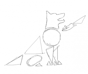
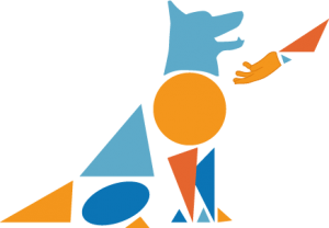
The above images depict Rowan’s second logo design drawn both traditionally (by her) and digitally (by myself). We agreed on the use of orange and blue as the brief wanted to have an element of ‘fun’ and also because the two colours are complimentary on the colour wheel. The use of geometric shapes was to keep the design simple and user friendly; they could also be interpreted metaphorically as ‘building blocks’ for the animal’s training. To avoid colour clash I used varying shades so that it would not cause eye strain for the user. Using geometric shapes in this fashion also meant that the logo could be used on a variety of platforms (such as a letterhead, on a mobile phone, etc.) which is what the company wanted according to the brief. As this design was a little more complex compared to the first one, we decided that this would not be the final image for the logo.


