Logo Design Over The Years

The history of the ITV logo

itv logo hr_0

2015 ITV logo

itv-oldlogos-1955-2012

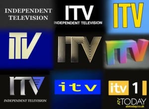
Looking at the previous logos, it is clear that ITV has followed the most common trends and patterns of universal company logos over the course of time. Firstly, the font has changed in the way that is has gone from serif to sans serif. The majority of the logos have also gotten rid of the extra ‘Independent Television’ text, presumably as the company became instantly recognisable as an acronym. Comparing the most recent logo to the previous ones, it has followed the pattern of using brighter colours and rounder shape styles to appeal to its increasingly younger target audience.

Good And Bad Logo Designs

Good Logo Design

EE logo

EE logo

The logo for mobile phone company EE is one example of good graphic and branding design. The minimalist style of shape keeps it simple and ‘clean’, allowing it to be user friendly for its (presumably young) target audience. The colours are bright and draws attention from its audience, however they are also complimentary making it easy on the eyes. There is no text or other information besides the two letters, which is commonly recognised from its television and online advertising. Therefore there is no necessity for added text or imagery as its purpose and content is instantly recognisable.

Bad Logo Design

1024px-Arm_&_Hammer_logo.svg

Arm & Hammer Logo

This is an example of what I consider to be a poor logo design. Despite its simple circular shape and serif font, the central image of the arm and hammer seems to clash with the surrounding colour red, as blue and red are not complimentary colours. The image of the arm and hammer signifies a different meaning to what the company actually promotes. To an audience who would have never heard of this brand before, it could be assumed that they would recognise it to symbolise a D.I.Y or construction company. However, this is not the case as it is actually a seller of specialised toothpaste.