2D Motion Tracking

This week in our workshops we discovered how to create and utilise the technology of 2D motion tracking. This was done using Adobe After Effects, although there is other software available which can be used in a similar manner. For convenience I will be shortening the term to ‘2DMT’.

What is 2D Motion Tracking?

2DMT is a type of tracking commonly used for small video projects and moving image manipulation. We experimented with how the technology worked using an example of a moving box in a defined space (as shown in the video below).

As shown in this example, 2DMT is a simple way of layering an image over another image to manipulate its original design. The concept shown in the video demonstrates a static image of a black and white checkered grid replacing one side of the cardboard box. The ‘track motion’ option on Adobe After Effects enables the software to pick out and define key points on an object. This then tracks its movement which creates a ‘path’ within the video, allowing a separate image to be applied. In the case of this example, the tracking points were applied to each corner of the box- the grid image was then linked to this tracking and therefore follows the path and movement of the box face.

Benefits and other uses

2D motion tracking can be very beneficial when making quick and simplistic edits or effects to a video. It can be used to replace signs, to display text onto a piece of paper in shot and for many other similar purposes. Advertising companies and other institutions could use this to create effects in their promotional videos. I could also use 2DMT for my personal video project to display information about myself, or to add visual enhancements for creativity.

Disadvantages

There are a few problems with 2DMT, one of them being the fact that it cannot track an object in shot if there are other obstructions. Another hinderance is that on a two-dimensional basis, motion tracking can only perceive movement on the X and Y axis- the Z axis cannot be traced in 2D which can cause problems if a particular image in the frame protrudes through this line. If the Z axis is to be used in a video then 3D motion tracking is needed to be able to detect this. Thirdly, tracking points only work effectively on an image that has high contrast points- in this particular instance the box works well because it provides a high contrast compared to the background footage. This can cause problems if the footage being used includes colours that are quite ‘flat’ or similar to each other, which risks the tracking points being lost as the object moves within the shot. Finally, 2DMT can become an issue if the footage being used was shot at a slow shutter speed. Although this can still track motion correctly the majority of the time, it can cause motion blur which can be distracting or create unwanted visuals.

Augmented Reality (AR)

This week we were looking at the basics of Augmented Reality. More commonly abbreviated as AR, the concept is continually growing and expanding towards public usage. First developed in 1990 by Professor Tom Caudell, AR has become increasingly relevant to the way we use technology both in our home, schools, workplaces etc.

How does it work?

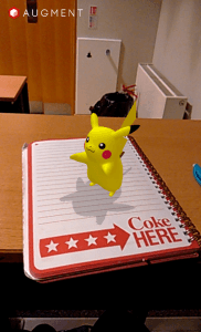
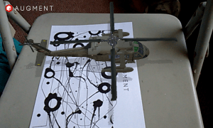
The simplest type of Augmented Reality is one that is commonly used on apps (such as Augment) for mobile phones and other similar hardware. Augment uses printable ‘trackers’ that the user can place in an open area and have their CGI model displayed onto them. Augment in particular allows users to customise their own trackers, print out a pre-developed design or to scan an object that will become a tracker temporarily. The below images are rough demonstrations of how the application works.

IMG_20151116_092636                                           IMG_20151109_110202

The first image of the helicopter model is an example using one of Augment’s pre-developed trackers that I printed. By projecting my mobile phone in the direction of the A4 tracker after having selected the model, the app ‘picks up’ the design and uses it as a surface to display the helicopter on top. The second image is an example of using a temporary tracker to display the Pikachu model- my notebook suffices as a tracker as the shape and size is suitable to allow 3D models to be shown.

What are the benefits?

Although Augmented Reality is still in development, it has proved to be useful in both a creative and practical sense. Museums have been able to enhance their materials on display by using similar tracking points to show 3D models in addition to real-world objects. It gives users a new insight into how they are able to watch, read and learn about history and culture. AR can also be used for educational purposes, i.e. architecture students can model and view their building elements in real-time on a small and convenient scale. Medical students can be shown a display of the human body in a more intricate and reflective design compared to a 2D textbook image. Another use that has been revised recently is for customers shopping for new furniture in their home- AR models of a sofa can be projected into their living room, allowing them to gain a rough idea of what the overall look will be before purchase, for example. Finally, I could use AR in my own project to display models of things that relate to me or describe my personality.

 Are there any flaws/drawbacks?

Currently, Augmented Reality  is still in a somewhat prototype phase. Looking at the models above, they provide a somewhat detailed image, although they fail in terms of texturing. The technology could be further developed so that 3D models will appear more realistic and less animated. Another problem is that apps such as Augment only allow so much room for the models to be shown on a small scale, which can be inconvenient if a user wanted to display multiple models at a time.


Projection Mapping

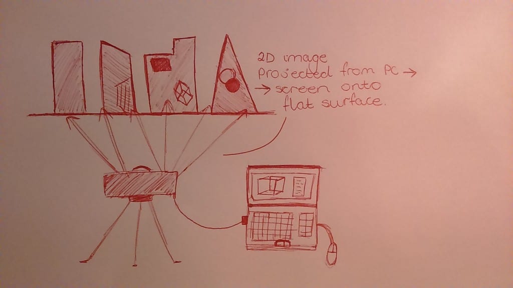
In our workshops this week we explored the idea of Projection Mapping, what it is and how it can be used in various ways. Below is a rough diagram that explains how the concept works on a small scale:

 DSC_0234 (1)


This is a basic example of how images and video can be projected onto various types of architecture. The computer software (such as HeavyM and Madmapper) is used to create shapes, designs, animations etc. before being fed into a projector and displayed on a surface. Sound can also be integrated so that items will react to music for example.

What are the possible uses?

As of current, projection mapping seems to be used purely for artistic experiment and technological advances. However, it could potentially go on to be used for educational purposes such as in primary school classrooms. It could also be used for medical reasons such as benefiting people’s mental health, by using the software to create therapeutic sessions (providing it is linked with professional methods of medical procedure). Industries may also benefit from this software as it will allow them to advertise their products in a new and innovative design; simultaneously being able to reach out easily to their target audience.

Disadvantages

Although projection mapping has its advantages, it also has its weak points. There are typical issues of health and safety which could affect people with photosensitive eyesight for example. It could also be dangerous in creating a distraction on buildings to traffic, aircraft and even pedestrians. The technology itself is also currently limited in terms of the types of surfaces it can be projected onto, as well as its visual quality.

Use in own project

For my personal project, projection mapping could be useful in enhancing the visuals used in the video. It would allow me to display my inner thoughts in a creative manner, for example showing phrases and images onto a brick wall as I walk past.

Logo Design for a Brief

This week, we were given a brief to design a logo for an Animal Behaviour Centre. Working in groups (with Rowan Barnes and Ben Adams) we collaborated with each other using Google Docs. We each gave a description of what we interpreted the brief to state; my own individual interpretation is listed below:

brief interpretation

We then did some research into what kind of logos we thought were designed well, which were used as inspiration for our own designs. Posted below are the specific designs had researched myself and my initial comments on them:

inspiration

After our research, we then began experimenting with some of our own logos. Below is the idea that I drafted on paper with explanation as to why I thought it was suitable:

own logo

After comparing our ideas, we then discussed which logo would best suit the brief and individually attempted to create the design digitally using Adobe Illustrator. I had picked one of Rowan’s designs (below) to re-create using this software.

Screen Shot 2015-10-01 at 10.56.47

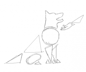
Logo Design- Traditional Sketch

Logo design Rowan

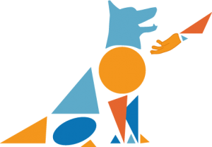
Logo Design- Digital Creation

The above images depict Rowan’s second logo design drawn both traditionally (by her) and digitally (by myself). We agreed on the use of orange and blue as the brief wanted to have an element of ‘fun’ and also because the two colours are complimentary on the colour wheel. The use of geometric shapes was to keep the design simple and user friendly; they could also be interpreted metaphorically as ‘building blocks’ for the animal’s training. To avoid colour clash I used varying shades so that it would not cause eye strain for the user. Using geometric shapes in this fashion also meant that the logo could be used on a variety of platforms (such as a letterhead, on a mobile phone, etc.) which is what the company wanted according to the brief. As this design was a little more complex compared to the first one, we decided that this would not be the final image for the logo.


Logo Design Over The Years

The history of the ITV logo

itv logo hr_0

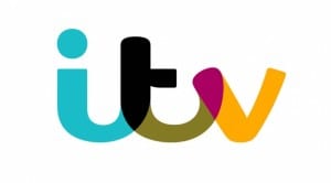
2015 ITV logo

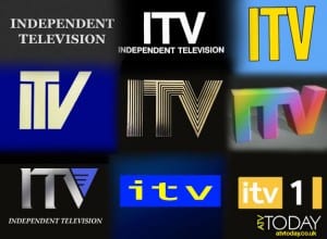
itv-oldlogos-1955-2012

Looking at the previous logos, it is clear that ITV has followed the most common trends and patterns of universal company logos over the course of time. Firstly, the font has changed in the way that is has gone from serif to sans serif. The majority of the logos have also gotten rid of the extra ‘Independent Television’ text, presumably as the company became instantly recognisable as an acronym. Comparing the most recent logo to the previous ones, it has followed the pattern of using brighter colours and rounder shape styles to appeal to its increasingly younger target audience.