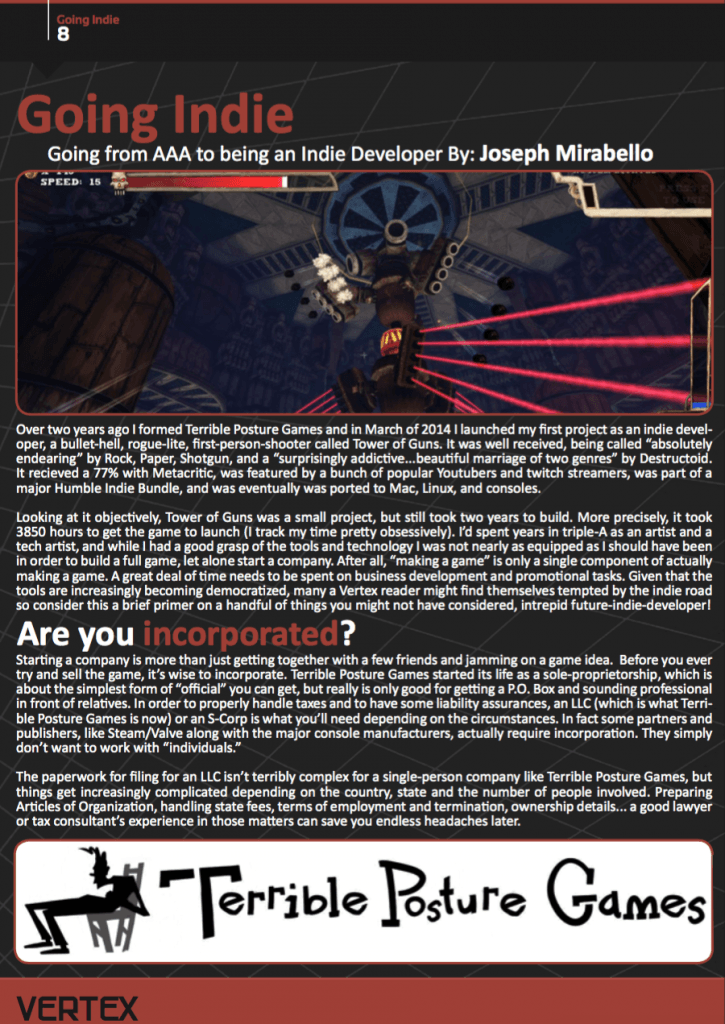
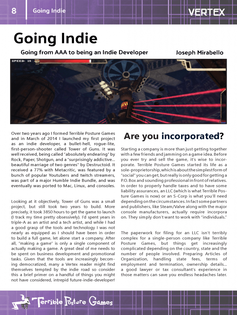
This is a re-design of a page from Vertex magazine using Adobe InDesign:
Original
My edit
I had made quite a few changes to the design, beginning with finding a background with a colour that was more suitable than black/dark grey. I applied this to the top and bottom of the image only so that the design would not be overcrowded. I found an image with a technological look in order to fit the theme of the magazine. I also felt that a white background with black text would be easier to read.
In regards to the font, I had decided that a serif font would be the most appropriate, similar to the look of the original. I aimed to emulate the original design by laying out the text in a similar fashion, however I moved the author’s name in order to get rid of white space. The word ‘incorporated’ is a colour taken from the image; this was to keep the design consistent throughout.
In order that the logo would be legible against the purple background, I had changed it to white and decided that it would look more appropriate where it did not take up a large space on the page. This was also done with regards to the rule of thirds and how we read from left to right. In order to balance this I moved the Vertex logo to the top-right of the page and changed it to white for the same reason.
Finally, the article text itself was written into columns so that the user could read it more clearly. The original design seemed to have the text going to the very far edges of the page and written across in wide paragraphs, which made it unappealing and difficult to pay attention to. Therefore I used the columns in InDesign to my advantage and spaced each paragraph out into visually smaller chunks. Not only does this give the illusion of less text, it also spreads out suitably across the white background, therefore filling in white space where there are no other images to do so.


