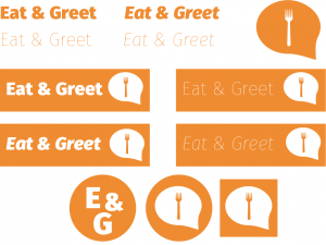
In order to establish a brand image for my website and mobile app, I had designed a few potential logos in Adobe Illustrator:
These are variations of the same name, including experimentations with typography and images. The top rectangular images could be used as part of the banner on the desktop website, compared to the ones below which would be used for the app and be more suitable for a mobile or tablet device.
Shape
After looking into the symbolism of shapes I had found that circles symbolise unity and have a ‘friendly’ approach, compared to triangles which are symbolic as hazardous and ‘threatening’. I chose to create the logo designs within squares as they represent structure and form, which is appropriate for a business. However, due to the target audience and purpose of the site I will most likely use the circle as this is a service which incorporates a social element. The image of the fork in the speech bubble represents what the title entails- it needed to have both an element of socialising and dining and be obvious enough as what the service provides.
Colour
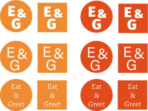
In terms of colour, I used orange as a theme and differentiated between a bright orange and a more red-toned orange. As orange is an energetic colour I felt that this would be appropriate for the project’s purpose, however I wanted to compare it to another colour so that I could see if it would make any improvements. Although the project does have a social element, as it is not specifically a social media tool I refrained from using blue as this might have been misinterpreted by the user.
Font
I had chosen a few various fonts and font styles in order that the logo would display the correct message as well as visual aesthetic. I also tried using both the initials of the project name and the full name itself, however I had found that the website would be more appropriate with the full name whereas the mobile would suit the initials. I altered between a serif and sans serif font as one looked more elegant, however I felt that this was not appropriate for the type of service it provided. I was careful to ensure that the overall design appealed to both genders and of people of all ages (above 18), hence why the image is ‘neutral’ and simplified.


