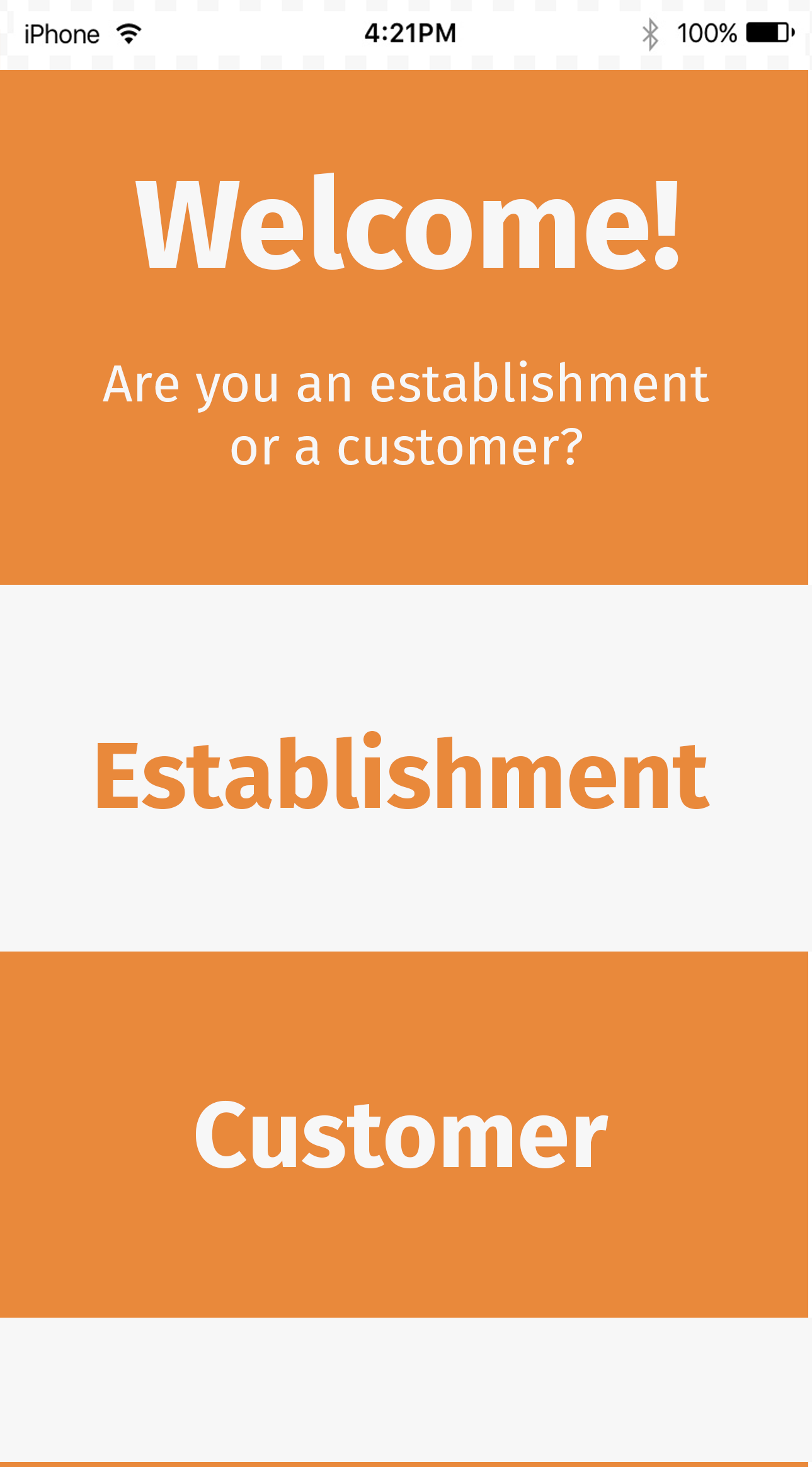
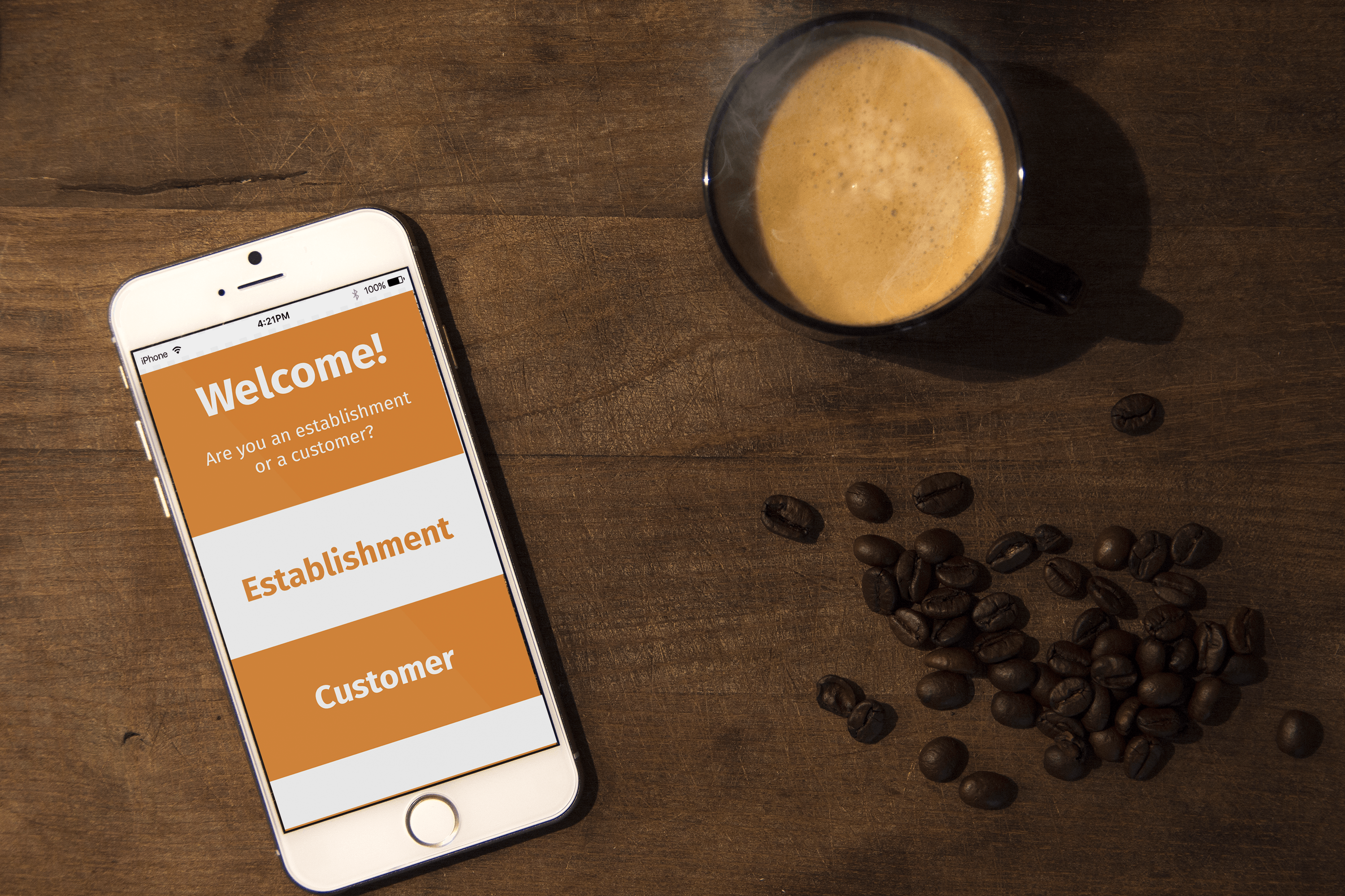
Welcome Page for the app
After having created the Wireframes for my mobile application, I then took these templates and created several designs in Photoshop, as shown below.
Customer version
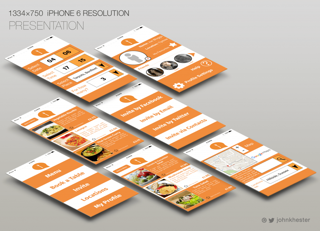
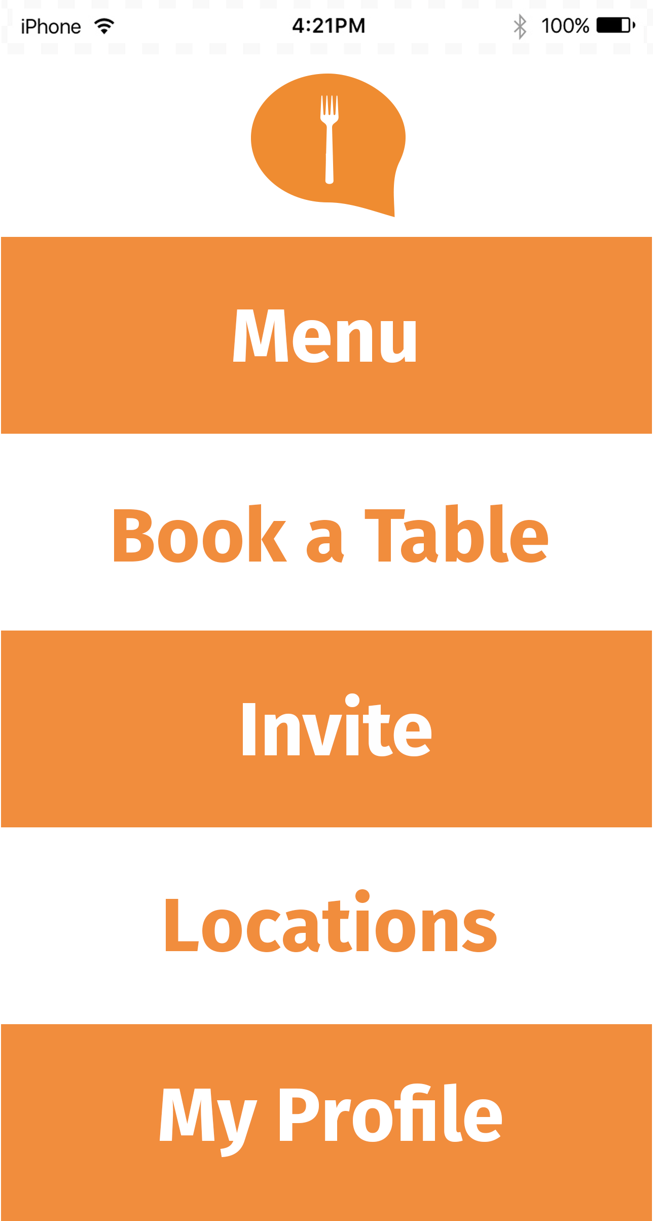
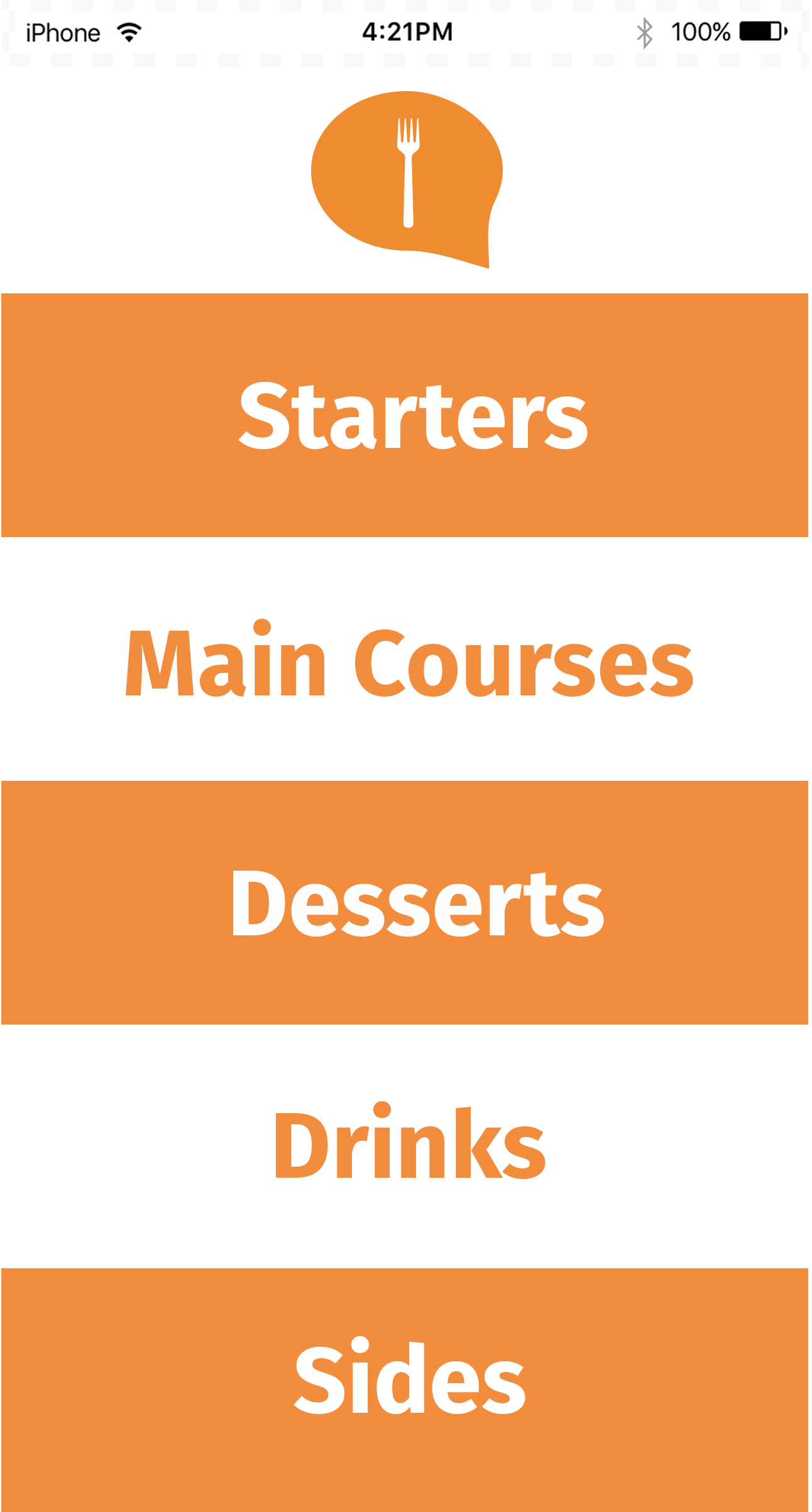
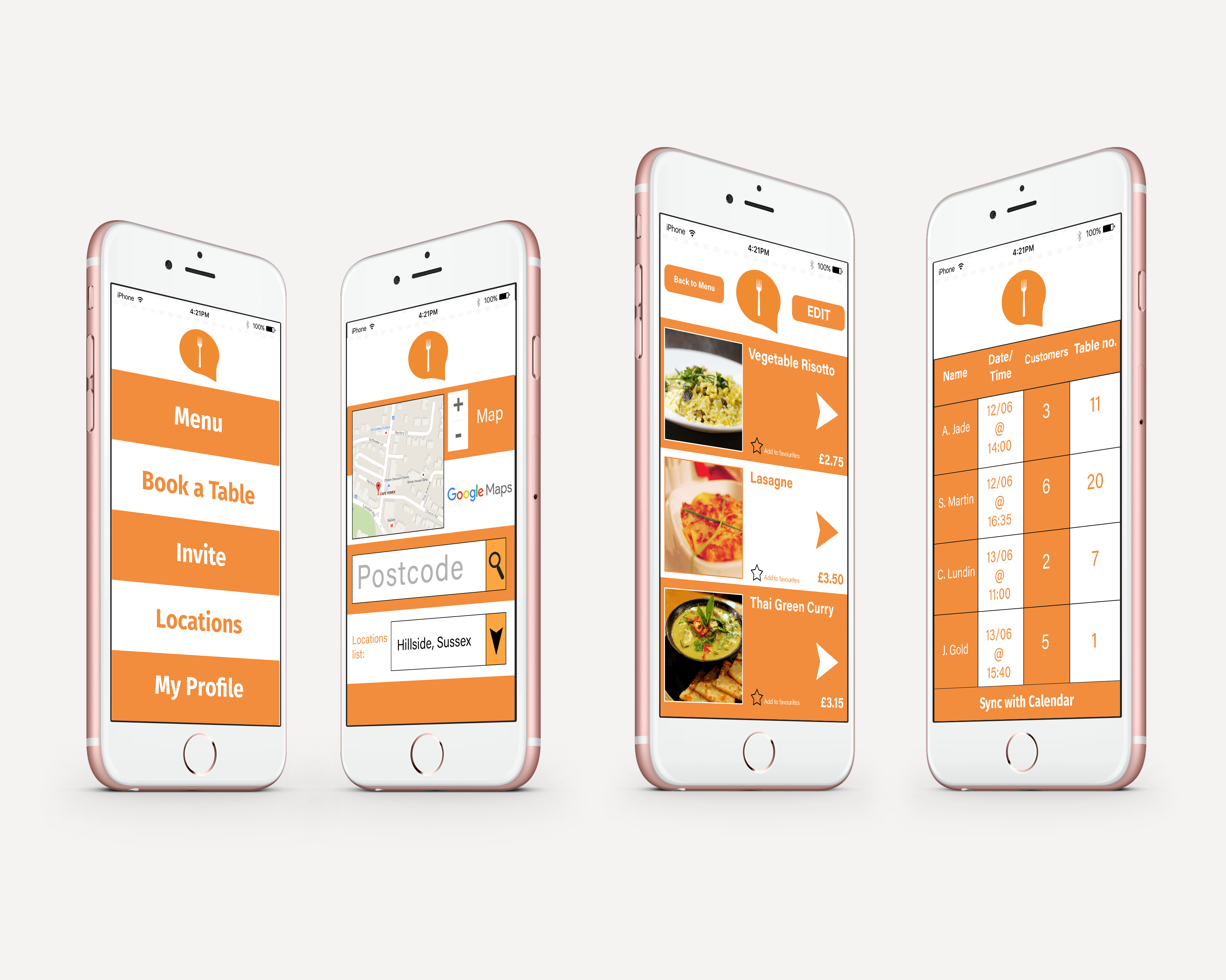
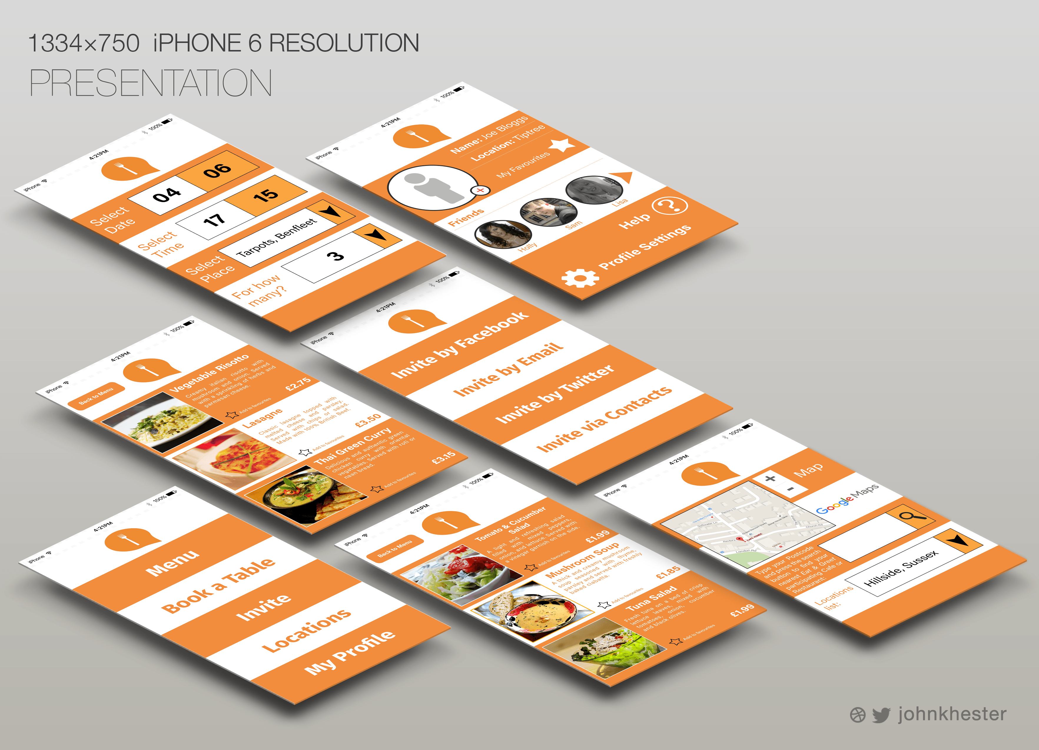
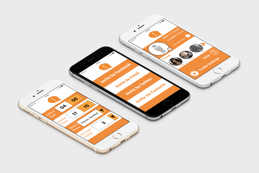
Using this iPhone 6 template, I have placed my designs individually so that it is easy to visualise what each screen looks like. Here are shown the most important pages which show the context and overall layout of the app, including sub-menus for Starters and Main Courses. The booking system, ‘Invite’ page and User Profile pages are also displayed. This is the version that will be shown to customers who are using the app. Some other examples using different iPhone templates are shown below:
Flat images:
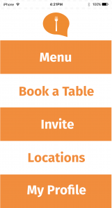
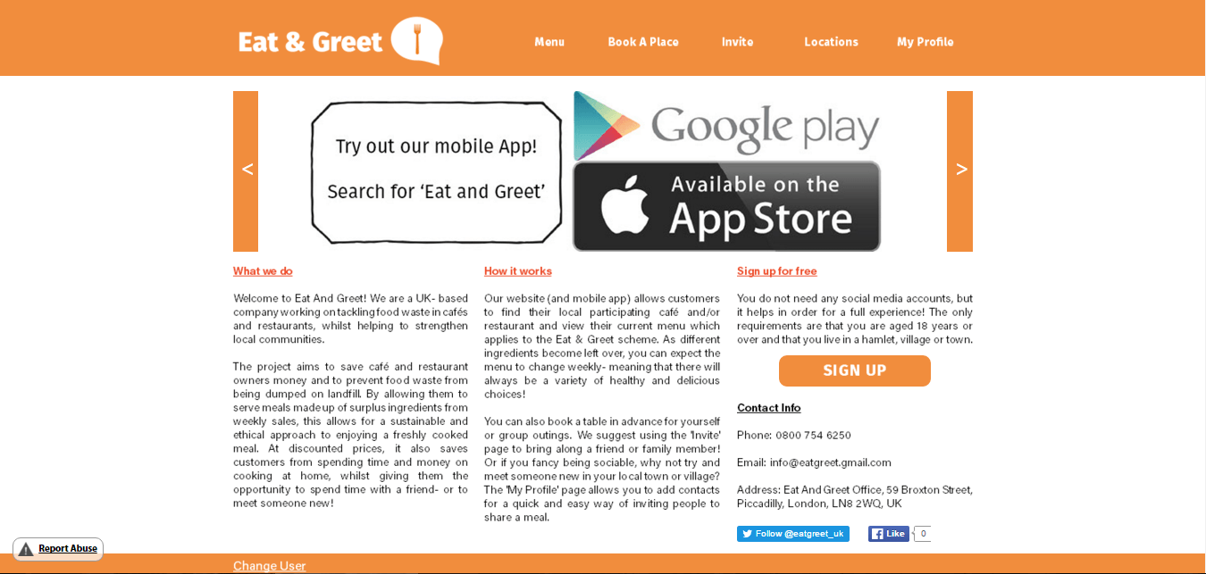
Considering my research into colour and layout, I had decided to go with the colour orange as it is energetic and eye-catching. After discussing with one of the end-users they said that they did not like the tone/shade of orange as it seemed dull and uninteresting. This would be something to consider if I were to re-design this. The alternating colours of white and orange were used to separate each section in order for the design to be clear and simple to understand. The research I did heavily influenced the layout of the mobile app, hence the ‘ladder’ structure of the text. Without any mouse or scroll-bar on a mobile device it was important that each section was big enough and clear enough that it could be selected on the touch-screen of a smartphone or tablet. Due to the small screen size, it was important that the logo (without the text) was always displayed at the top of the screen so that the user could easily navigate back to the main page.
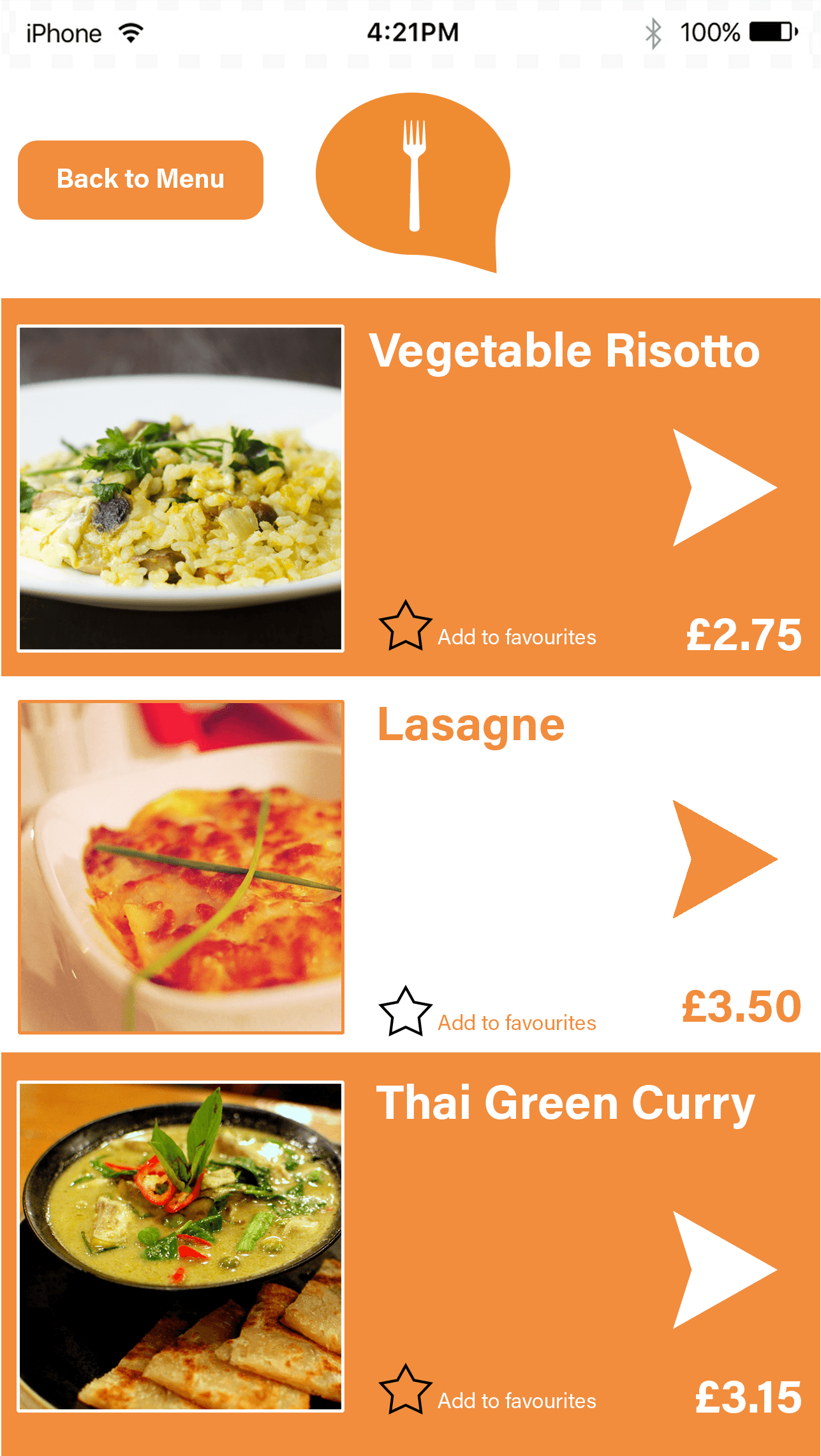
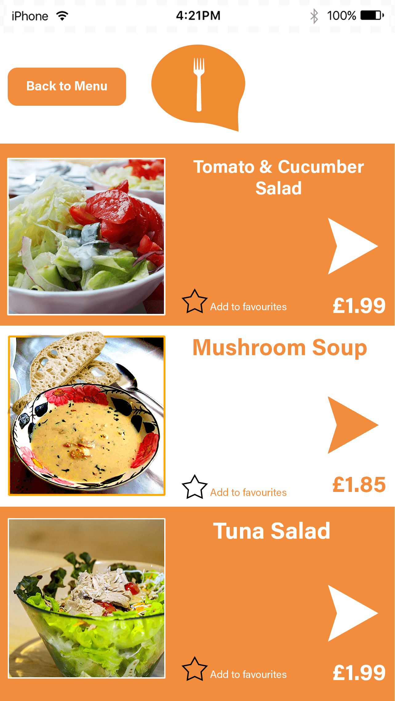
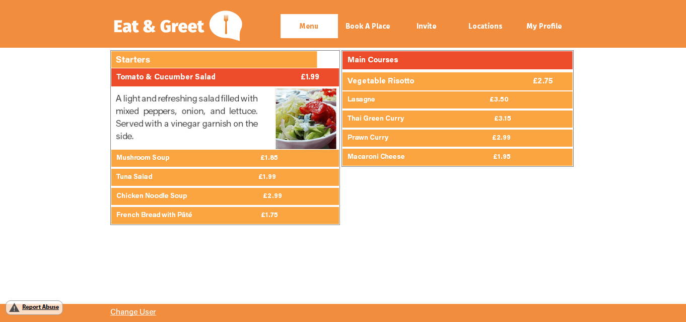
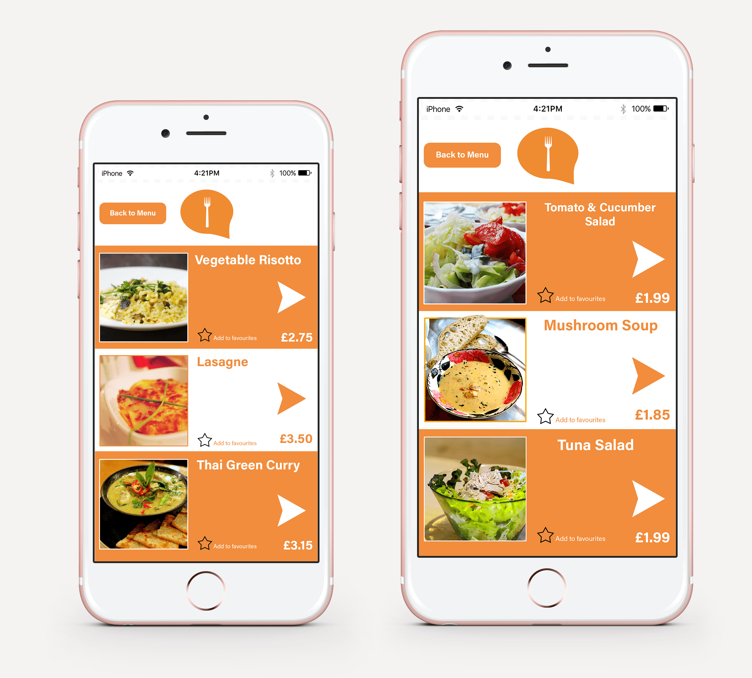
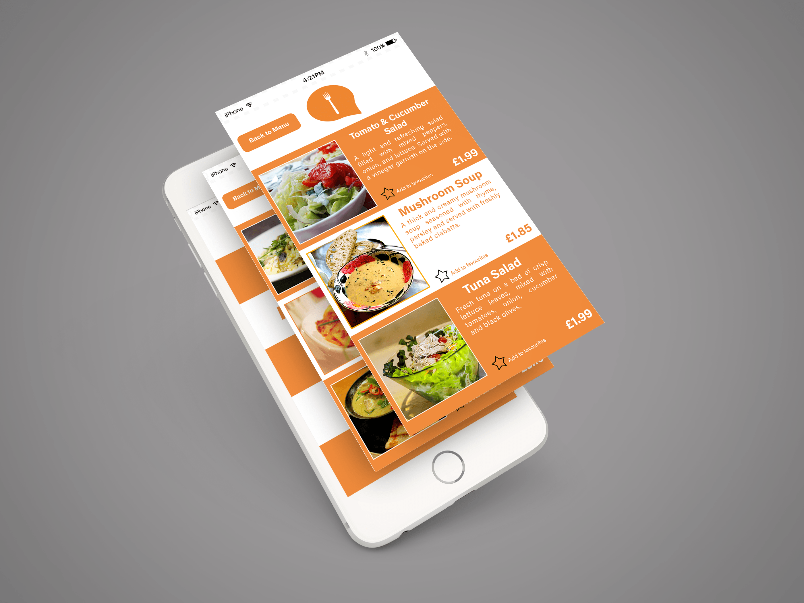
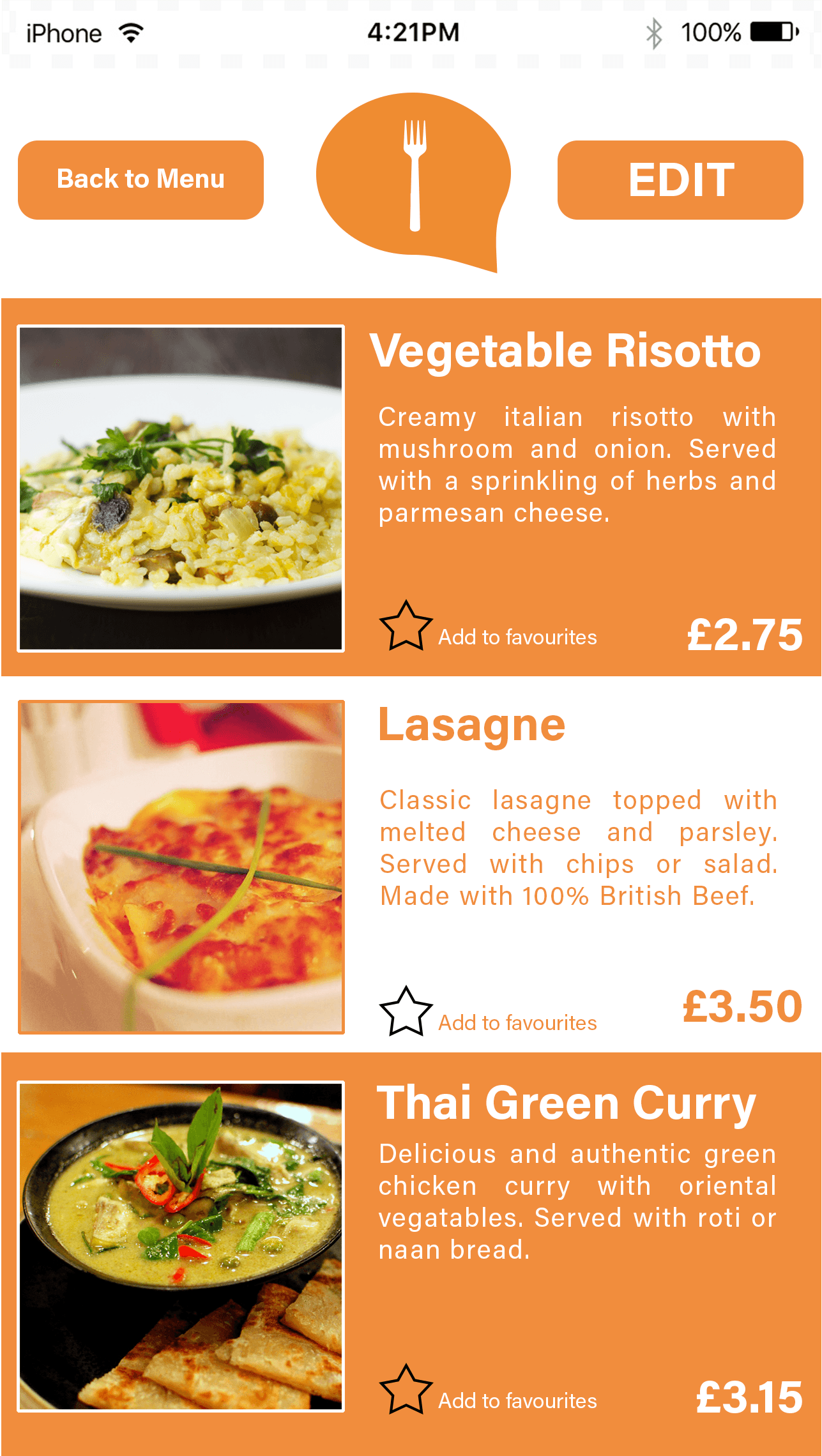
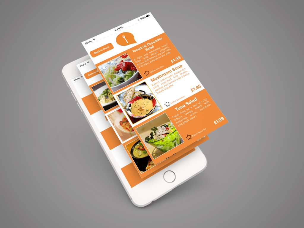
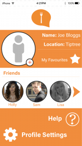
For the menu pages, I felt that it was necessary to have small images of each menu item so that it would give an idea as to what to expect before ordering. A small description is situated to the right of the image in order to reflect the design of a physical paper menu. I had taken into consideration that unlike Android devices, iPhones do not have a built-in ‘back’ button, therefore the decision to add a small ‘back to Menu’ button was necessary. For pages that only have one screen, the logo at the top would suffice in taking the user back to the main page. A star icon which can be tapped would add that particular item to the user’s favourites, so they can refer back to this in future if it is something they wish to order again.
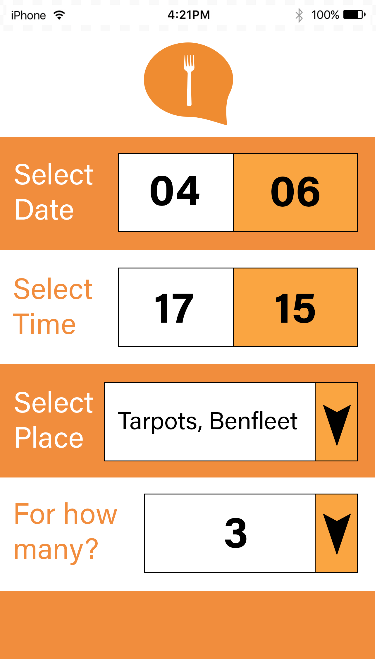
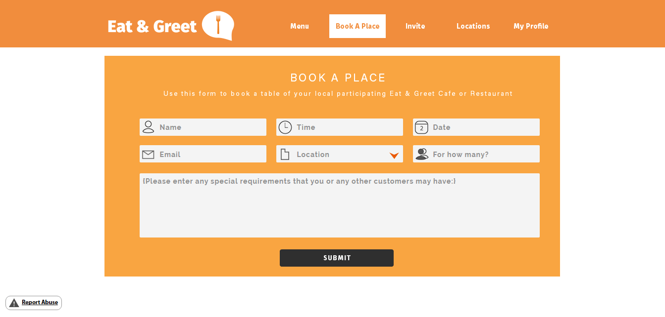
The ‘Book a Place’ page was made as simple as possible for the user so that it would save time and effort to book a table. The drop-down arrows would bring up a ‘pop-up’ box which would allow the user to select the value needed- this is commonly done on most mobile apps. Once all values are selected the device would then display a message asking the user if they are ready to move on to the next page- this is so that they can enter their personal details before finally confirming their booking.
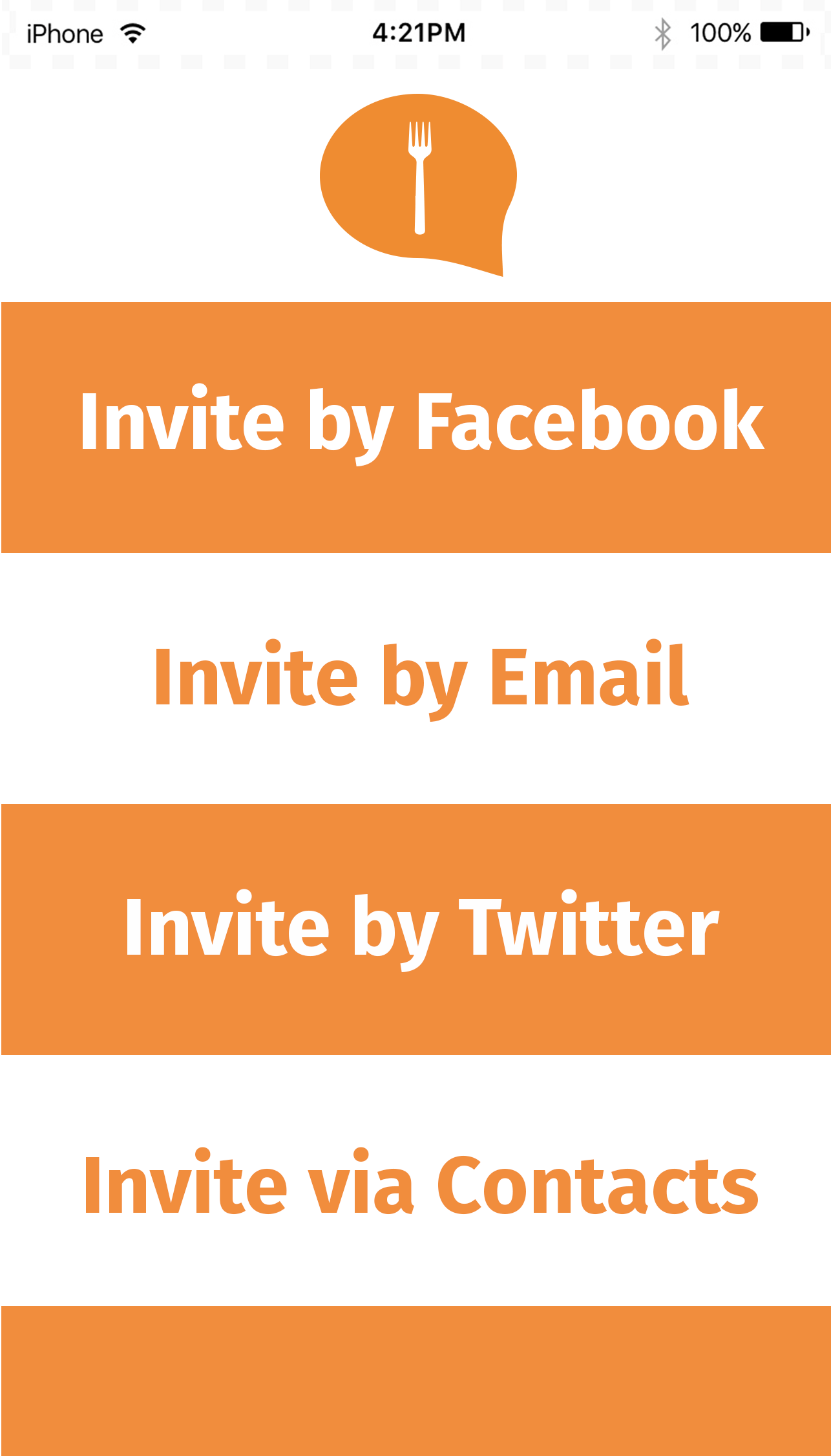
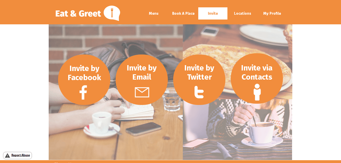
The ‘Invite’ page was a key factor which I needed in order to fulfill the project’s purpose which I had made in my proposal. The links to various social media sites (with the option of inviting users off of the website/app itself) would help to integrate the social and community feature which would make the project stand-out from others. As Facebook and Twitter are so commonly used by members of the target audience it was necessary for the app to have a built-in feature which would automatically send out an invite using the user’s social media profiles. The email option is also there as a consideration of those who may not have a social media account or who may feel uncomfortable using it.
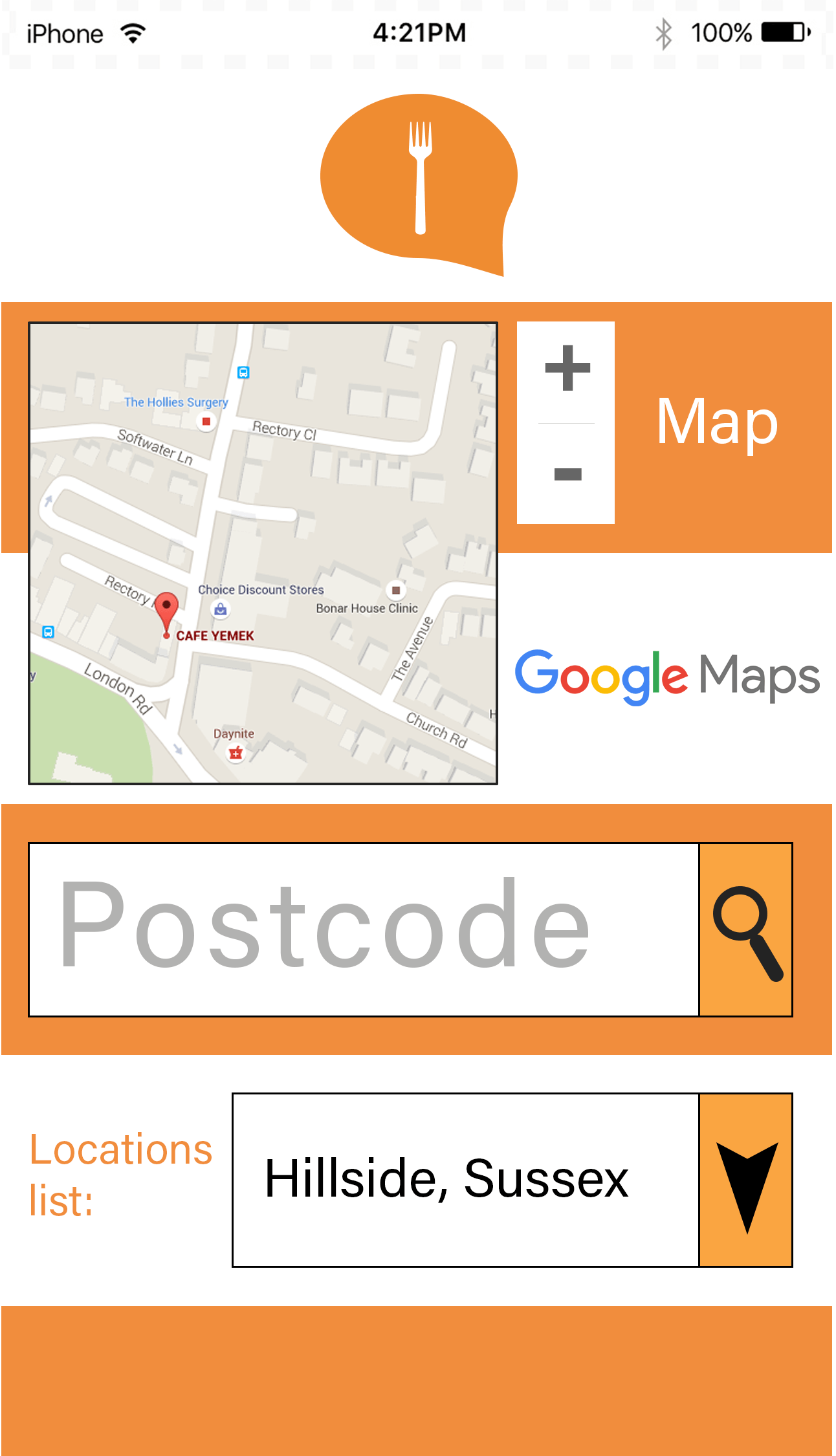
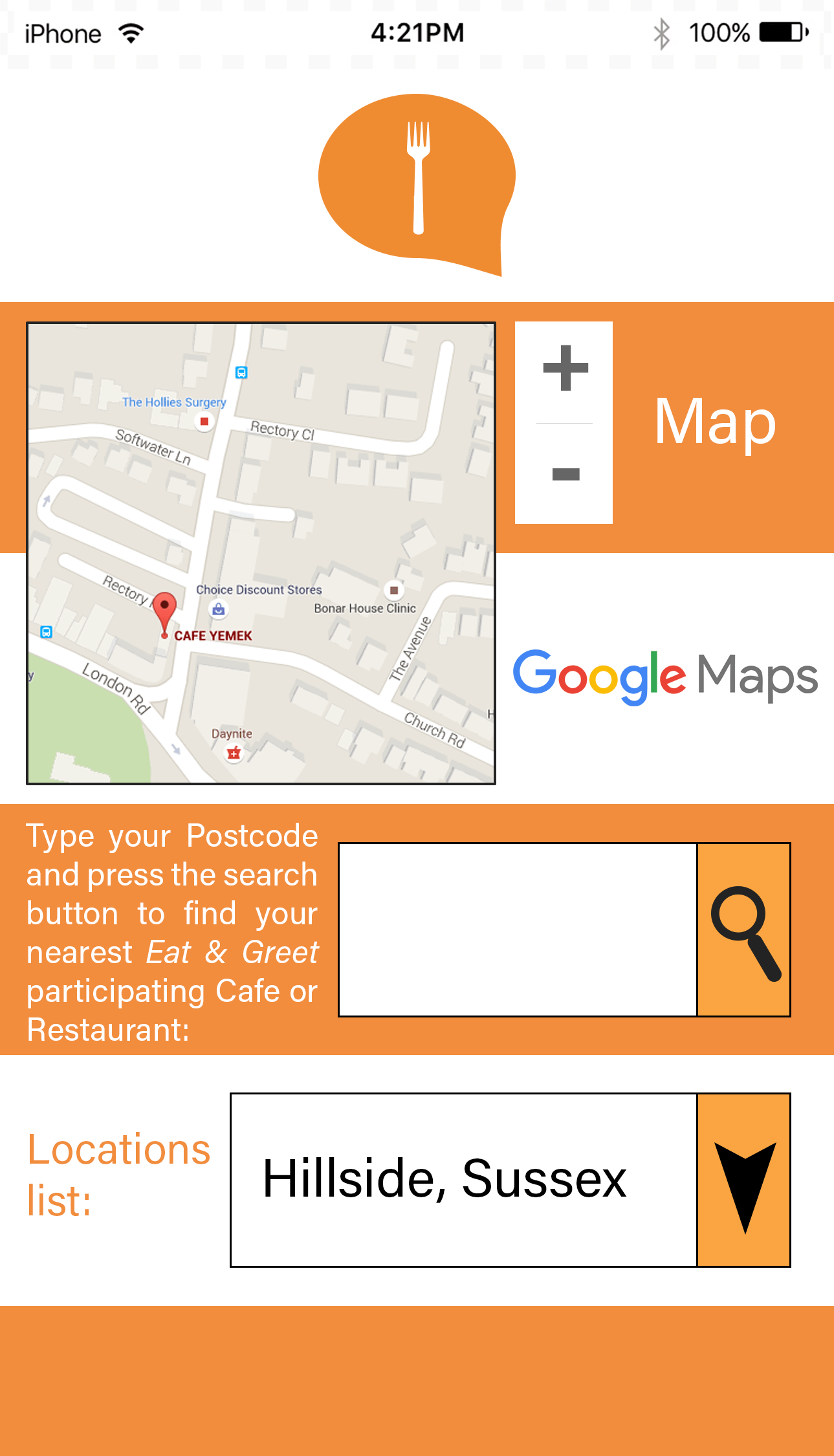
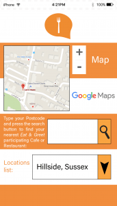
The ‘Locations’ page would allow the user to see all the locations of their local Eat & Greet cafes/restaurants by simply entering their postcode. An integrated Google Map feature was used so that the address could be easily found- this would also display the address of the location selected from the drop-down menu.
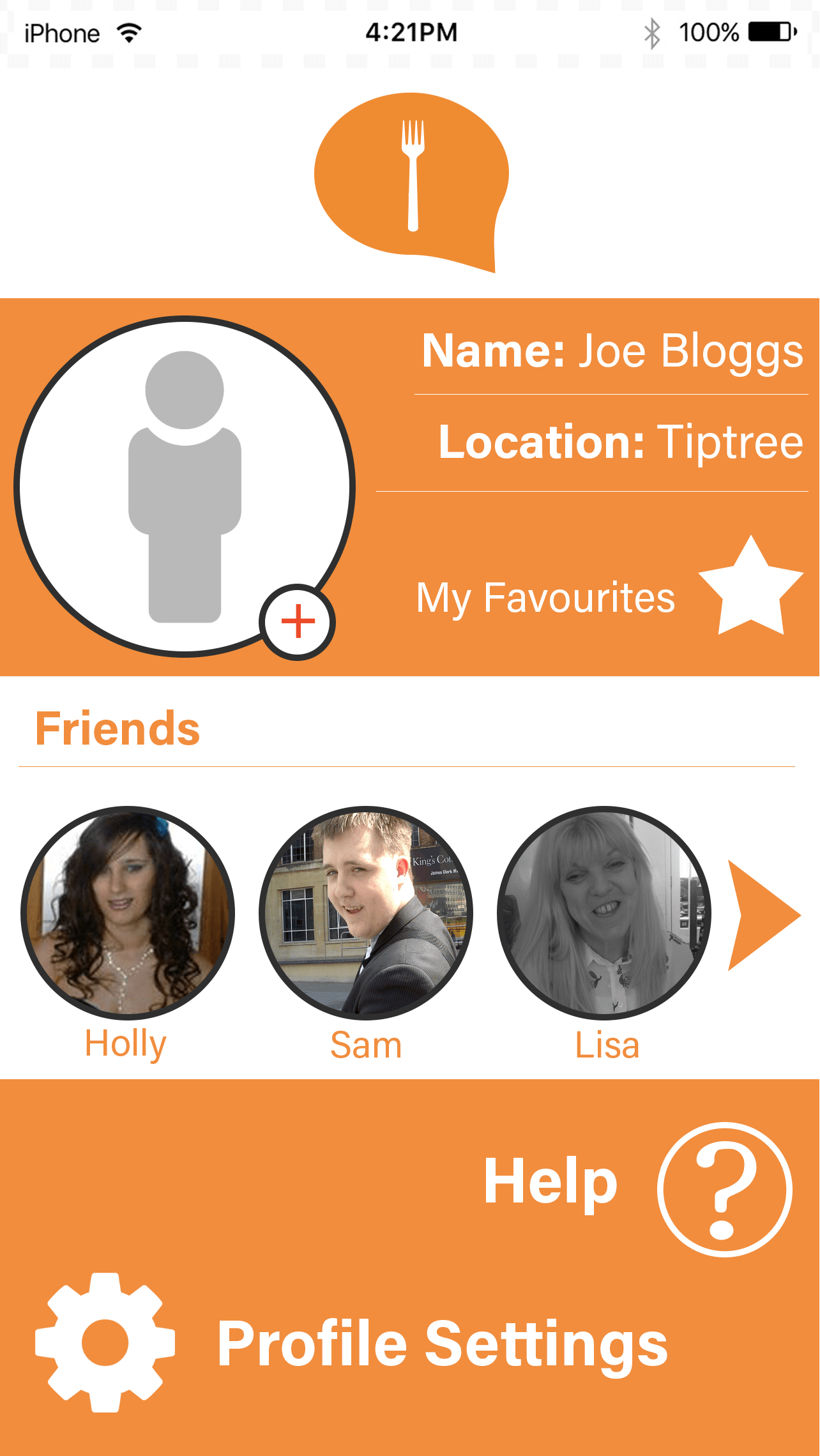
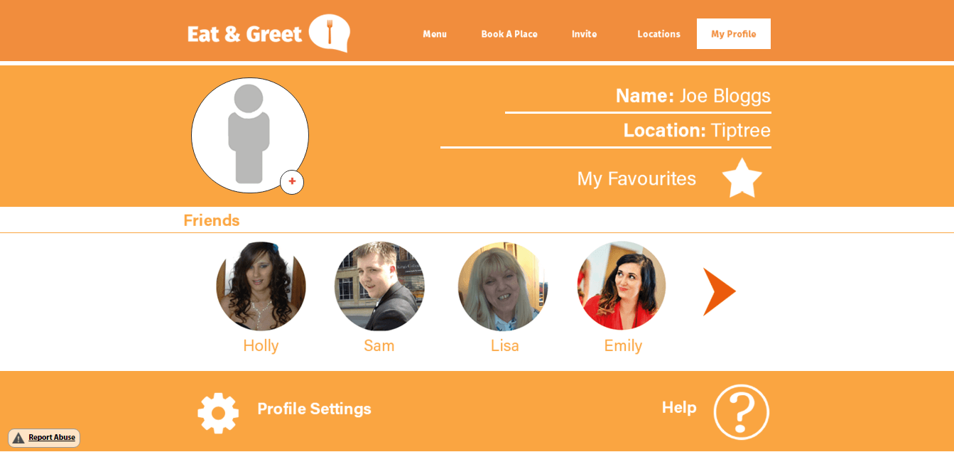
Finally, the ‘My Profile’ page was created so that the user could have a place to store their ‘Friends/Contacts’ for multiple reasons- to add a more personal touch, to allow the ‘Invite by Contacts’ page to function and also to allow the user to see their favourite menu items. There is a help section for FAQs as well as Profile Settings, which would allow for personal information to be changed and a user to log in/log out. The arrow to the right of the page is there so that the user can scroll through their list of friends. Their friend’s profiles can also be brought up when their icon is pressed.
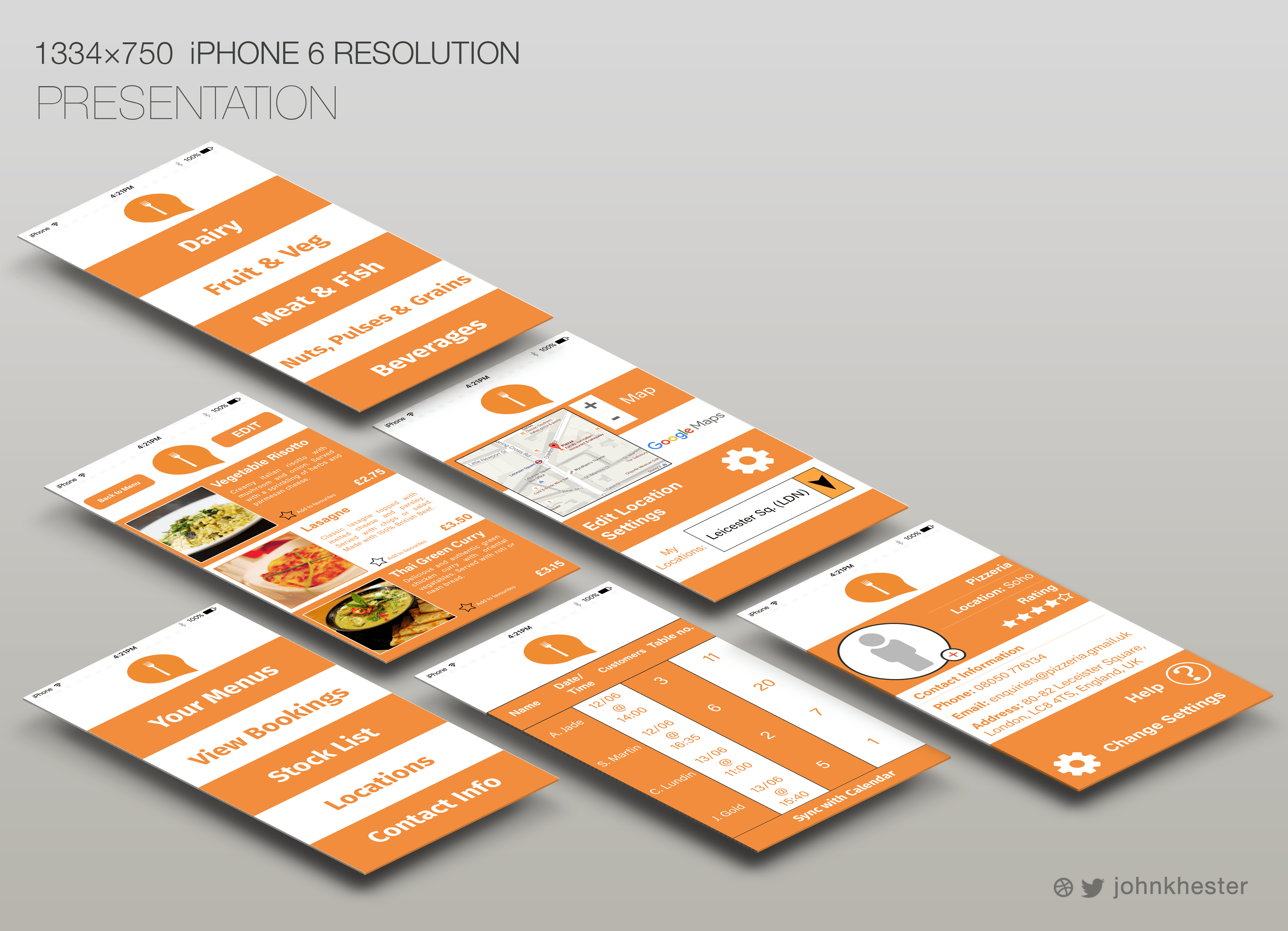
Establishment version

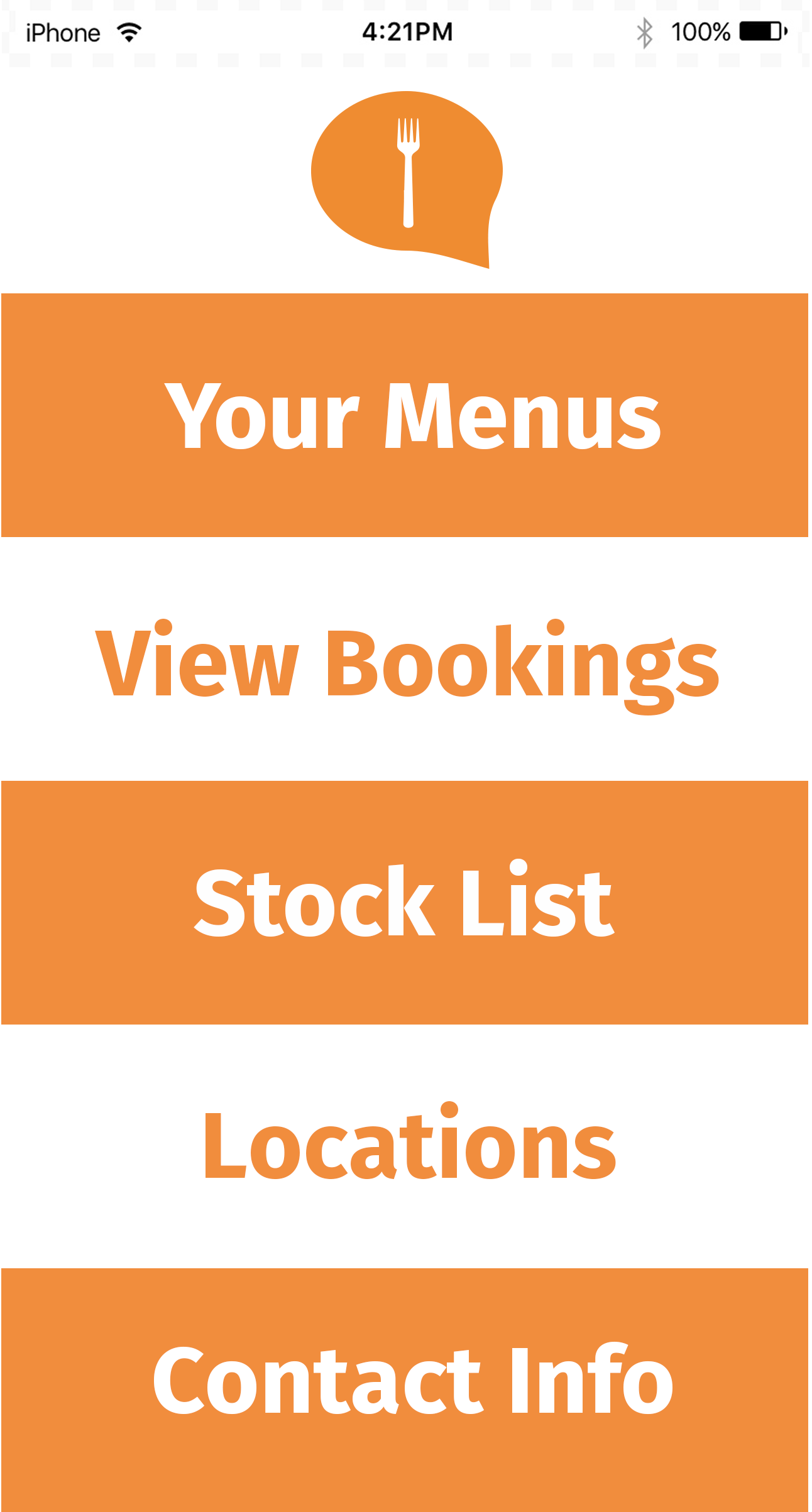
Similarly to the Customer version, I had created a design for the Establishment (Cafe/Restaurant owner). This was necessary in order to fit the theme and aim of my project, as both end users would need to have control over the app’s functions. However, this version differs in the way that some screens have been altered for different purposes that the customer would have no use for.
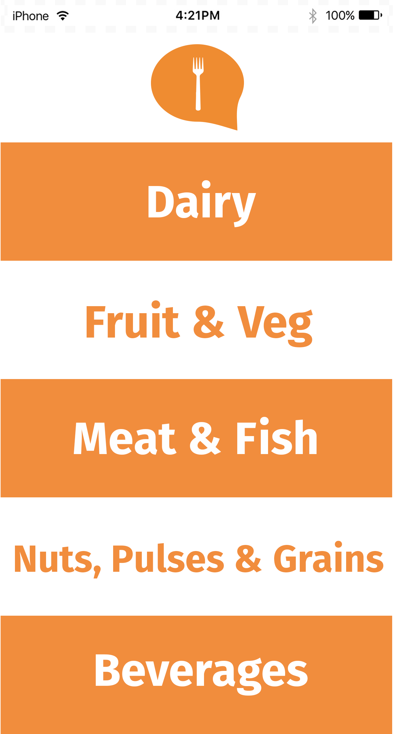
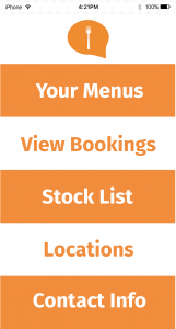
Although the layout is consistent, the ‘Invite’ page has been changed to a Stock List in order for the Owner to see what products they have remaining to make meals from. The following menu is split into categories of food so it is more efficient for the user to keep track of their stock- and can then use listed surplus ingredients to make their menus.
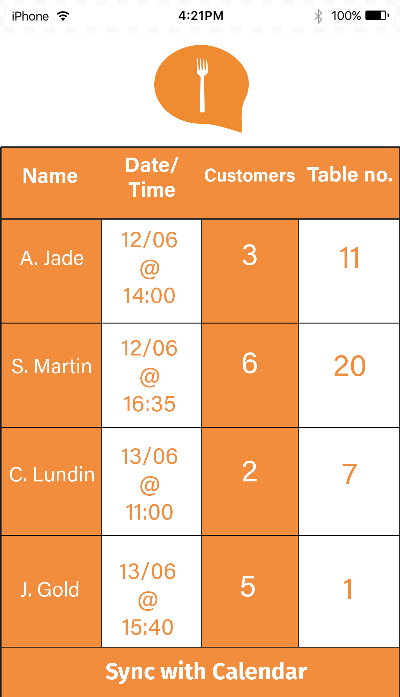
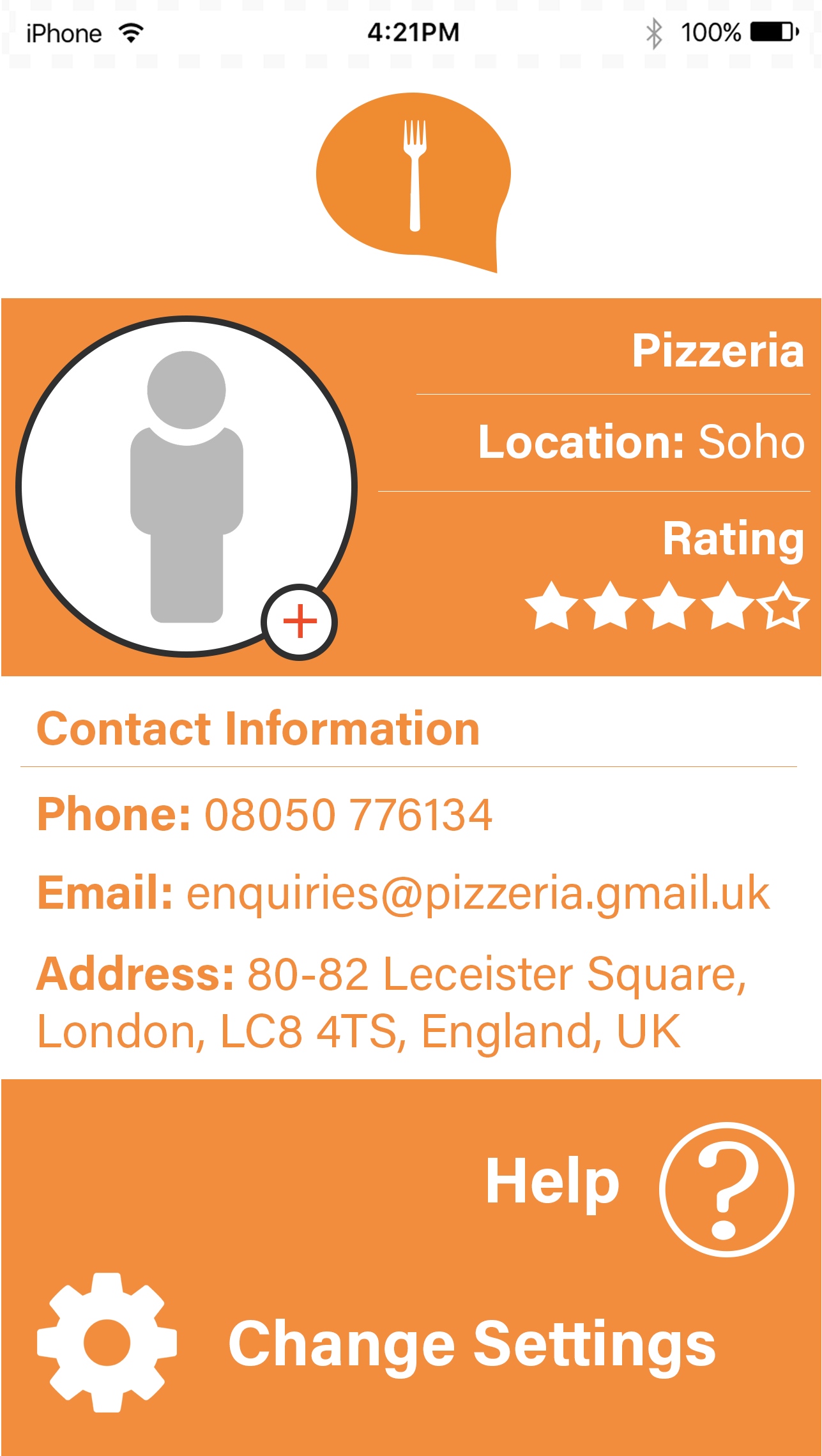
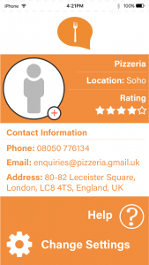
The Menu pages (only one shown in this example) have an ‘Edit’ option so that the user can choose what meals they will be serving. The Bookings page is different so that the Owner can see what customers to expect, as well as the Locations page with the option to edit the address if the Owner has more than one Restaurant, for example (or has changed address). Finally the ‘Profile’ page serves as a generic information page with the Cafe/Restaurant name, rating and contact information. Some clearer examples are shown below:

iPhone 6 template source: https://colorlib.com/wp/free-psd-iphone-6-mockup-templates/